Wednesday, May 24, 2023

The Different Dimensions of Accessibility: Cognitive: Training for Accessibility (Part 6)

While often overlooked, cognitive disabilities are perhaps one of the most common yet least seen of the disability families we have discussed. Cognitive disabilities are varied and present some challenges that can affect how navigate and interact with online content. 
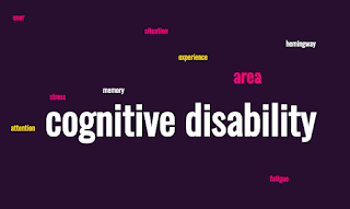
word cloud for cognitive disabilities: words include cognitive, disability, 
area
, attention
, experience, 
fatigue
, hemingway, 
memory
, situation
, stress
, user
word cloud for cognitive disabilities: words include cognitive, disability, area, attention, experience, fatigue, Hemingway, memory, situation, stress, user


Cognitive disabilities cover a broad range of conditions. Memory, attention, comprehension, and problem-solving are all affected, and for some people, all of the boxes are checked. 

Primary Disabilities

Down Syndrome: a genetic condition where people have an extra copy of chromosome 21. Cognitive impairments, delayed development, and distinctive physical features are often seen in this condition. Levels of cognitive impairment can vary from mild to severe.

Dyslexia: a learning disability that can affect reading, spelling, and language comprehension. They may swap letters or read certain characters out of order or need to step back and slowly read the text to process what they are seeing.

Dyspraxia: Also referred to as Developmental Coordination Disorder. While often considered a mobility disability, dyspraxia can also have an effect on the actions of writing and typing and cause stress to cognitive functions as well.

Traumatic Brain Injury: A sudden impact to the head such as a concussion or bone breakage in the skull can cause long-term issues with memory, attention, and problem-solving.

Fetal Alcohol Spectrum Disorders: people exposed to pre-natal alcohol in high amounts during their development in pregnancy can develop a range of disabilities. these can affect memory, attention, impulse control, and social skills.

Secondary/Situational Disabilities

Cognitive disabilities are perhaps one of the areas where situational disabilities may be the most prevalent. There are numerous situations that can put a strain on our mental faculties and can cause us issues that are not necessarily long standing. Many of these share similarities but these are all situations any of us could find ourselves dealing with.

Cognitive Overload: stressed, fatigue, or just having a million things coming at us all at once. These situations can make it more difficult for us to process information and make decisions.

Reduced Attention Span: again, stress and fatigue can contribute to this, as well as side effects of medication or recreational alcohol or drug consumption. 

Memory Impairment: there can be a lot of situations that lead to this. Again, stress and fatigue but also just being in an unfamiliar or foreign environment, especially one where the language that is spoken/written is foreign to you. 

Design Considerations for Cognitive Disabilities

When we want to address Accessibility and accessibile design for cognitive issues, it's important to realize that each area is unique, and individuals within these categories can have varying strengths, challenges, and needs. This is definitely the area where one size will not fit all and a lot more judgment calls are required. Still, here are several suggestions that should help considerably and make the experience better for all users.

Avoid Complex Navigation: having multiple layers of nested content or menus of menus is not ideal. It's easy to lose track of where a user is and then trying to get back to that location could be challenging if not impossible. Try to limit menus to one layer at maximum if possible.

Avoid Overwhelming With Information: A wall of text is not welcoming to anyone and for people with cognitive disabilities it is even more daunting. Try to use space, break up large paragraphs, and aim for a simplicity of message where it makes sense. 

Allow for Longer Time Limits: Aim to make it so that timers or time pressures are minimized. Some systems require this but make it so that the value can be adjusted reasonably

Provide Alternative Means for Content Display: Have clear labels and do not assume that users will get by inference what is meant by using a color in isolation or a metaphor that may be well known but some people may not be aware of that meaning. Provide clear labels and alternatives that will provide more context if necessary.

Avoid High Contrast or Flashing Content: this is an example of where a suggestion that works well for one group could be a distraction or a problem for another. High contrast screens that help those with vision issues could be too stressful to read or look at for people with cognitive disabilities. Having the ability to easily adjust the contrast can be a big help. Overly aggressive flashing and strobing is just a bad approach overall, IMO.

Use fonts that are not overly busy or decorative: font choice can have a profound effect o the readability of online text and for people with cognitive issues, overly fancy fonts can be a struggle to read. aim to make sans-serif fonts and typical typefaces a standard or make it easy for these typefaces to be selected. 

Write For Everyone (and Learn to Love Hemingway): this is perhaps one of my favorite cognitive tools to use, the Hemingway Editor. I get occasional raised eyebrows when I mention that I think of Hemingway as an Accessibility tool but I really see it as such. Hemingway is designed to help you improve writing from a clarity standpoint and also to help fix/avoid overly complex prose or impenetrable walls of text. You can also set a reading comprehension level and see how well your writing falls into that level (or doesn't).

As I stated at the beginning, cognitive disabilities are perhaps the most common and also the most neglected because we don't necessarily "see' them. Understanding how many there are and how varied they are, we can see a lot of areas that we can do better and can look out for to help make the experience of being online and using digital products better and more usable. Again, it doesn't take much in this stressful and fast-moving world to feel overwhelmed. These additional Accessibility features might be the ticket to making better interfaces and experiences for all of us.
Monday, May 22, 2023

The Different Dimensions of Accessibility: Mobility: Training for Accessibility (Part 5)

 When we think about accessibility and people with disabilities, mobility is the area that we are most familiar with and the most obvious of disabilities. We also refer to these as physical or motor disabilities. Most of the accessibility options that we see in public and in infrastructure are specifically for mobility disability. This is also the disability family we are most familiar with and can most readily see. 

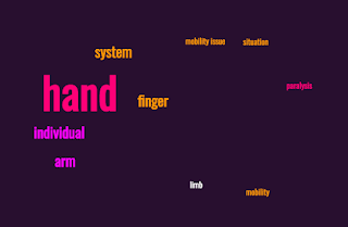
Word cloud related to mobility and motor disabilities. Words include: hand, individual, arm, system, finger, limb, mobility, situation, paralysis
Word cloud related to mobility and motor disabilities.


There are many aspects that create unique challenges when it comes to mobility disability. On one hand, you could have someone with paralysis from the waist down with a spinal injury. this person will need to use a wheelchair to get around but they have full use of their arms, hands, and fingers, as well as eyesight and hearing. In the digital world sense, they are as able-bodied as anyone else. That is not the case for a person with severe arthritis, cerebral palsy, or paralysis that includes their arms or hands. In addition, limb amputation or missing limbs or parts of limbs create challenges in interacting with devices. 

Primary/Persistent Mobility Impairments

There are various mobility or motor disabilities that fall under the category of primary or persistent issues. 

Spinal Cord Injury: Individuals with spinal cord injuries may experience paralysis or limited mobility in their limbs. This can range from paralysis in their legs only but full control of arms, torso, hands, neck, etc., and then variations that also include fingers, hands, arms, neck, etc. 

Cerebral Palsy: Cerebral palsy is a neurological condition that can result in difficulty with moving or coordinating limbs and extremities. Fine motor control or the ability to use fingers independently may be limited or not possible. 

Muscular Dystrophy: This is a range of genetic conditions that often result in muscle weakness or limited dexterity due to difficulty in movement. It's a progressive condition that gets worse over time.

Multiple Sclerosis: This is a disease caused by an attack on the central nervous system, specifically the myelin that coats the nerves. It can impact the brain, spinal cord, and optic nerves. MS is an issue for visual and cognitive disabilities as well as mobility.

Arthritis: This is inflammation and pain in the joints. Holding onto items or typing on individual keys with multiple fingers or moving around and navigating a touch screen can be painful.

Amputation: A loss of limbs due to amputation is a significant issue when it comes to inputting information or navigating on systems, especially those designed around a keyboard and mouse or touch screens. 

Tremors/Convulsions: Tremors can be caused by a number of conditions, Parkinson's Disease being a common and well-known example. This makes fine movements or steady controlled touch or sliding motions challenging.


Secondary/Situational Mobility Impairments

Injuries:
fractures to the arm, hand, or fingers can hinder the ability of an individual to perform tasks that they might otherwise be able to were they not injured. The same goes for post-surgical procedures. These are situations that can render our extremities in a limited range of motion or in some cases no motion at all. On the plus side, we may be back to normal in a few weeks or months but during that injury/recovery period, we may have little to no use of our arms, hands, or fingers.

Otherwise Engaged Hands:  This may sound silly but numerous situations would fall into the category of secondary or situational "mobility impairment". Some of these situations could be as temporary as "my hands are full" or "I'm driving a vehicle". We don't often think of these as impairments but they are situations where the user may not be able to use their hands or otherwise interact with a product when necessary. 

Adapting to Mobility Issues

There are a range of methods to work with that will allow individuals who have mobility issues to better interact with their devices. There are numerous examples of methods and tools that can help with mitigating mobility issues such as:

Alternative Input devices: These can range from joysticks, to blow tubes, to software that tracks eye movement, to capacitance devices that can be held in the mouth, to large button arrays that will allow individuals to more effectively press and order button pushes to enable certain command sequences.

Voice Recognition Software: In certain cases, controlling the system with voice directives will allow hands-free operation. Additionally, screen readers can also be helpful with mobility accessibility.

Ergonomic devices: These can be specialized or split-level keyboards, larger buttons, or alternative layouts. Large trackballs are also commonly used as input devices where using a mouse would not be possible.


Some additional factors worth considering are:

- Make it possible for actions that can be clicked to have large buttons on the screen or to have the ability to access via the keyboard (press Tab to highlight the item and press Enter to perform the desired button click)

- make it possible to allow for multiple keystrokes to be seen as a more complex action or one where the need to hold down multiple keys simultaneously can be performed in another manner.

- use dictation software or other means to allow the user to speak workflows and have the system respond to them.

- provide space on the screen so that form fields can be accessed and do not require the user to have to pinpoint exactly where they need to focus their attention.

- ensure that workflows can be accomplished without the need for a mouse or multiple nested steps.

- make it possible for users to set longer timeouts if they are needed at all as many mobility issues may require a longer time to accomplish the steps necessary.

Individuals with mobility or motor disabilities can have a variety of issues and therefore may need to have a variety of tools to enable them to perform key tasks and interact with online content. It may be a challenge to have a testing situation where all of the possibilities can be tested but there are many ways to simulate these scenarios. It may take some creativity and imagination but I strongly encourage modeling and thinking about how someone would interact with your systems and applications were they unable to have full use of or full control of their hands. Learning to adapt to and putting yourself into these situations will likely provide you with many suggestions you can bring back to the design and code teams to help ake these interactions better for people with mobility issues and by doing that, help make products that are more usable for everyone.

Saturday, May 20, 2023

Yes, you can test anywhere, even the gym

​Taking a short break from the Accessibility content to ask some “what if” questions. Note, I’m not doing this to shame anyone or make broader comments, just to show that interesting things can be found everywhere :).

Thankfully, my gym is not very expensive, and during this "semi-enforced woodshedding period" I am getting to experience, I can still go to my local gym and get some much-needed body and mind adjustment. In any event, there's a lot of equipment in the gym with a mix of free weights, machines, cardio, and other apparatus to take advantage of.

With that, here’s my gym’s kettlebell rack:

My Gym's kettle bell rack, with medicine balls and slam balls as well
My Gym's kettlebell rack, with medicine balls and slam balls as well

And over here is a bigger apparatus with a number of pulleys and a heavy bag. 


Separate equipment rack with pulleys, rope, and heavy bag


What it also has on it are these QR codes. 

QR codes on the heavy bag rack

These are used for a variety of functions, including bringing up tracking and exercise routines to use. One of them is for the heavy bag… which makes sense, as there is a heavy bag here.


But here’s something interesting. What other code is here?

Connect Kettlebell QR Code


Huh. A kettlebell code. Okay, so let me scan that and pick up… oh, wait!

the kettlebell rack is on the other side of the gym
Turning from the kettlebell QR code to see the kettlebell rack, on the other side of the gym

That’s quite a distance between the kettlebell code and the actual kettlebells. Is there a problem here?

Again, I’m approaching this as a “what if” and trying to think why this would be arranged this way and it’s not as ridiculous as it looks on the surface. This gym has a sister facility in the East Bay (actually, several) and the one I attend from time to time has both of these pieces of equipment. There, these pieces are facing each other and in that case, having the QR code on the pole and turning around to grab the kettlebell makes perfect sense. However, my resident gym layout doesn’t allow for that, so they had to split these pieces of equipment up.

My point is, there may be perfectly good reasons why something is set up the way it is. Whether or not something is an issue is up to interpretation. I definitely don’t think the distance between the two is a feature. Still, the fix could be easy and inexpensive (heck, next to free). Merely taking a picture of the QR code, printing it, and taping it to the kettlebell rack would be a huge benefit. Ordering a more permanent sticker I could not imagine costing more than a couple of dollars.

So there you go, weird and random quality and testing musings on a Saturday morning. You’re welcome :).

Thursday, May 18, 2023

The Different Dimensions of Accessibility: Auditory: Training for Accessibility (Part 4)

 I was hopeful yesterday when I was making my post on the dimensions of accessibility that I'd be able to cover all four of the main areas in one blog post. I could have if I wanted to make a post that was exceptionally long but that's not my point in doing this. Instead, I realized that it made sense to break the main areas up and look at them independently and consider the realities that each area faces, both in the way of chronic/persistent conditions, as well as those that are transient/situational. If you are enjoying this series, thanks for coming along for the ride, there are lots more coming in the next several days.

Wordcloud for Auditory Accessibility: Keywords include: sound, difficulty, auditory accessibility, hearing, individual, disease, auditory information, person, Ménière's


Auditory Accessibility

When we are discussing auditory accessibility, we are specifically looking at challenges faced by individuals with hearing impairments. Just as visual impairment is a spectrum, so is auditory impairment. Additionally, there are both chronic/persistent issues that we consider to be primary issues as well as situational challenges that may be transient but certainly matter at that moment.

Chronic Auditory Challenges

Deafness: This term is not as cut and dry as many would believe. Just like blindness does not mean a 100% loss of sight, deafness does not necessarily mean a 100% loss of hearing. The term "deaf" refers to individuals with significant or profound hearing loss. What is significant or profound? A medical Audiologist would consider the severity of hearing loss in decibels (dB). In other words, at what decibel level would a sound have to be for a person to hear it? I am not an audiologist, so do not take what I am saying as gospel but the following values come from the American Speech-Language-Hearing Association (ASHA)

Degree of hearing lossHearing loss range (dB HL)
Normal–10 to 15
Slight16 to 25
Mild26 to 40
Moderate41 to 55
Moderately severe56 to 70
Severe71 to 90
Profound91+
Source: Clark, J. G. (1981). Uses and abuses of hearing loss classification. Asha, 23, 493–500.

To put this into perspective, a person with normal hearing would be able to distinguish sounds within the -10 to 15 dB range, while a person with severe or profound hearing loss would need to have the same sound ramped up to 71dB or above 91dB to hear the same sound. Those people within the severe to the profound range are what we consider to be "deaf". These are people for whom traditional methods of using devices like hearing aids or cochlear implants will not help.

Hard of Hearing: This is a broader category and may include people on any level of the auditory spectrum. For that matter, hard of hearing can absolutely be situational. People with mild or moderate hearing loss may struggle to understand or interpret sounds in noisy environments or may be limited to the frequencies that they can hear. We can also include conditions such as Tinnitus and Ménière's Disease. Tinnitus is the perception of sound where there is a ringing, buzzing, or hissing sound in the ears. It can prove to be a distraction when. auditory information is present. Ménière's disease is a disorder of the inner ear that affects both hearing and balance. People with Ménière's disease often describe experiencing vertigo, fluctuation of hearing levels, experiencing tinnitus, and a feeling of pressure inside their ears.

Auditory Processing Disorders: these are difficulties in processing and interpreting auditory information by the brain, even when the person experiencing them has normal hearing sensitivity. There are a variety of these disorders.  They may include:

  • Auditory Discrimination Disorder: difficulty in differentiating similar sounds ('P', 'B', and 'D' may sound similar). 
  • Auditory Figure-Ground Discrimination Disorder: difficulty understanding speech/sounds in the presence of background noise or many sources of sound.
  • Auditory Sequencing Disorder: difficulty understanding and/or recalling the sequence of sounds or words.
  • Auditory Integration Disorder: difficulty localizing or integrating sounds coming from different directions.
  • Auditory Closure Disorder: difficulty filling in details of missing or incomplete sound information.
  • Auditory Memory Disorder: difficulty recalling spoken information or sequences of instructions. 
  • Auditory Attention Disorder: difficulty concentrating on sound/information presentation and keeping that focus for an extended period.

Situational Challenges

While the above examples could be seen as being persistent or chronic issues, any of them are also situational or temporary. More common examples of situational auditory issues would include:

Noisy Environments: Background noise in public spaces, workplaces, or crowded areas. My favorite example of this is trying to take a phone call in the middle of a rock concert. That's gijg to be an issue for just about everyone, not just hearing-impaired individuals.

Poor Audio Quality: As a podcast producer, I have had occasions where the recordings we had to work with were... not optimal. In some cases, they were downright bad because the technology we had at the time was just not up to the task but we had to run with it anyway.

Multitasking and Distraction: having to divide attention between numerous audio sources.


So that's a pretty big list of things to have to consider. How do we code and test for accessibility in these situations?

Captions and Transcripts: Provide accurate and synchronized captions or transcripts for audio and video content. Many services do this automatically and the results vary. Still, having a mostly correct transcript is better than not having one at all but if possible, provide a sequenced file that can be displayed in time with the information and that has been proofread and is as close to the audio as possible.

Volume Controls: allowing users to amplify the sound to their specific needs and levels.

Visual Cues and Alerts: Do not rely solely on auditory cues. Create visual options, such as flashing light, varying color or brightness for icons, or allowing for vibration through the mouse or keyboard, if possible.

Clear and Concise Content: where possible, provide simple and clean audio tracks. Avoid the background music if it can be seen as distracting, or allow for an option to separate the vocal track so that it doesn't compete with other sounds.

Avoid Audio-Only Interactions: Minimize interactions that are specifically sound driven. Make text-based or visual alternatives if possible.

Consider Multimodal Options: incorporate sign language interpreters, transcripts, or visual aids for presentations, conferences, or online events.


Sometimes, addressing auditory accessibility may conflict with other accessibility areas. There is no one-size-fits-all approach here. Changes made for auditory accessibility may not be ideal for visibility, mobility, or cognitive accessibility. This is where we have to make judgment calls and not only focus on compliance from a checklist. Still, by considering and implementing appropriate design and coding, and testing for them, we can ensure individuals with hearing impairments have as much access to auditory information and content as possible.


Wednesday, May 17, 2023

The Different Dimensions of Accessibility: Visual : Training for Accessibility (Part 3)

There are many ways in which we have made great strides in focusing on accessibility. The tools we have at our disposal to both allow for information to be accessible and the tools that are available to help us develop for, test for, and advocate for accessibility are growing all the time. It's an area that can be as deep and wide as you want to make it.

Word cloud for Visual Accessibility issues. Keywords used: Content, device, eye, images, accessibility, user, visual accessibility, contrast, fact, issue.

One factor that gets overlooked, however, is. that accessibility is not a one size fits all problem. In fact, what may work well as an accessibility fix for one issue may be totally inadequate for another. When we discuss accessibility, we typically group these issues into four main areas: visual, auditory, mobility, and cognitive. We can also consider the fact that there are levels of barriers faced depending on the severity and permanence of a particular disability. These range from total to partial, everyday to temporary, and even situational, where the environment a person is in may benefit from accessibility features that would not be necessary were they not in that particular environment at that time.

Today I'm going to focus on the area that tends to get the most attention, which is visual accessibility.


Visual Accessibility

There is a broad range of visual disabilities and impairments that people deal with. These can range from diminished vision and the way that light hits the eyes. There are a variety of visual challenges people can deal with at varying levels.

Persistent (or Chronic) Issues

At the top end of the spectrum are people who deal with complete or profound blindness. Being blind is not necessarily the total absence of light or color (for some, it is) but there are conditions where the inability to get a clear focus on something is significant enough to be considered total blindness. Less severe but as persistent is color blindness. This is where people have difficulty seeing a specific color or picking different colors from one another. In a world where color combinations are often used to impart meaning, this can lock out certain people or at the least make the intended message ambiguous. Photophobiamakes people sensitive to bright light, so very bright backgrounds or flashing content make it challenging to look at certain pages or apps, much less navigate them.

Less severe are conditions such as near and far-sightedness as well as amblyopia (often called "lazy eye"), strabismus (misalignment of the eyes), and astigmatism (the curvature of the eye is off, resulting in distorted vision). Age also plays a factor in the flexibility of the cornea. It's why so many people have to shift to using reading glasses when they reach about age 45 (perhaps the largest market for accessibility technology is the market for reading glasses).


Situational Challenges

There are also a variety of situations that people may find themselves in where their vision can be affected temporarily. eye injury, surgery, or everyday eye strain can put an everyday person with normative vision in a situation where they need to have accommodations to see effectively for a time. 

Often the lighting can change in which if a device or application cannot adjust the brightness or change the size of fonts, it can become a challenge in low or bright light environments. One example that is still common is the fact that many websites are not scaled or modified to work with phones or smaller devices, making the navigation and reading of these sites difficult if not impossible.

Perhaps the most common aspect of accessibility is the use of screen readers and by saying that an application or a service allows a screen reader to work with it, that makes the system accessible. It's definitely a good start but there's much more to visual accessibility than using a screen reader.

Some Basic Accommodations

Alt Text: by including alt text with images, the users of screen readers can hear what the image is displaying and can get a better understanding of what the image is looking to convey (note: descriptive text should explain what the image would be trying to convey to a sighted user).

Color Contrast: By making it possible to either have sufficient contrast o making it possible for the user to easily adjust the contrast, we make it so that backgrounds and foregrounds don't blend together and make the site unreadable to those who would have trouble differentiating the shades.

Use clear and legible fonts: this is an art but having fonts that are easy to distinguish, contrast strongly between letters, numbers, and symbols, and use space effectively will allow for more people to better ready the content that is displayed.

Responsive Design: this is where we can resize and reorder content depending on the display being used (and specifically using and defining an agent that reflects the screen/device being used. Responsive designs allow for a better layout specific to the device displaying the information and eliminate having to resize and zoom in to key areas.

Text Resizing: this will allow the users to adjust the text size easily, either through browser settings or built-in controls on the pages themselves to allow for resizing of fonts and yet and having those resizes scale to the rest of the page elements.

Screen Reader Adaptability: It's important to make sure that the content that we want to have people access can be understood clearly and that we don't burden them with words or content that doesn't matter to them. Also, most visually impaired users will not be able to rely on a mouse for navigation. Using a keyboard or a device that effectively moves focus to different elements is critical. Also, it is important to limit the number of steps required to perform certain actions unless absolutely necessary.

Forms, Buttons, and Sliders: Many of the "eye candy" elements of web pages and apps are difficult to maneuver through when using only the keyboard or screen reader prompts. Make it possible to allow for these interactions with the least amount of interference or the necessity for detailed shortcut steps where possible.

As you can see, there are a number of avenues to consider and situations to get familiar with when it comes to dealing with visual issues. With time and practice, we can all get a better feel and understanding for these challenges and make it possible that there are ways that people can interact with our content when they can't see it the same way that we do.

Tuesday, May 16, 2023

A Very Quick and Somewhat Incomplete History of Accessibility: Training for Accessibility: A Series (Part 2)

As I've been thinking about Accessibility and how I might construct training for it, I figured the History of Accessibility, at least as it relates to the United States, would be interesting. As the digital world has been with us since the end of World War II, many of the adaptations that are discussed came about after that, specifically starting with the 1960s.  


In the 1960s, researchers began exploring accessibility for people with disabilities. Early efforts focused on creating hardware and software adaptations for individuals with limited mobility or vision.

In 1973, the U.S. passed the Rehabilitation Act and specifically Section 504 was passed. This was an important step in that federally funded programs could not discriminate based on disability. Anyone who knows anything about federal programs gets that they can have a tremendous impact on software development, even back in the 70s. We see this today with the fact that lots of software get purchased by the federal government and they can often demand that certain requirements be met and companies will jump to make sure they are able to get those dollars. In this case, it made for a marketplace where accessibility technology had a chance to make money. 

The 1970s and 1980s were a time where Accessibility products and projects made a big jump. IBM introduced ScreenReader in the mid-1970s. While only available for IBM computers, it was still a working example where on-screen text could be reliably converted into recognizable (albeit synthesized) speech.  Apple OutSpoken provided a similar product for the Apple II, providing access to text-based applications.

The Refreshable Braille Display was another big jump, allowing users to type in to their computers and then read back the responses or actions from a flat display that would raise and lower small nubs that, when the user passed their fingers over them, would represent braille and allow blind or sight impaired users to "see" through touch, and moving to the next line would refresh all of the characters.  

A variety of alternate input devices became commonplace in the 1980s. An example I remember seeing early on in my late teens was a large trackball where the spinning ball was the size of a softball with large buttons. Sip-and-puff switches allowed users the ability to control devices and access switches by inhaling and exhaling.

In addition to the refreshable Braille Display, braille translation software made it possible to print off documents that were translated to braille.

A big step for Accessibility came with the popularization of the World Wide Web and other countries also stepping in and making laws that fought against discrimination of disabilities, as well as providing incentives for developing standards to help people with disabilities get access to information.

In the U.S. the Americans with Disabilities Act (ADA) of 1990 was passed and expanded on the Rehabilititation Act of 1973, though this was more of a physical infrastructure focus. In 1998, Section 504 got some additional strength with the passage of the ADA and Section 508, which specifically dealt with requiring federal agencies to comply with regulations making information and technology more readily available to people with disabilities. 

The UK passed the Disability Discrimination Act (DDA) in 1995. The EU likewise took center stage with the Web Accessibility Initiative (WAI) in 1997, sponsored by the World Wide Web Consortium (W3C). Australia introduced the Disability Discrimination Act (DDA) in 1992. 

The EU took steps to establish the World Wide Web Consortium (W3C), an international standards organization. It created the Web Content Accessibility Guidelines (WCAG) 1.0 in 1999, providing a framework for creating accessible websites. Today, most people who look at and consider Accessibility look at the WCAG requirements first, because if the WGAG requirements are met, a large percentage of any other country's Accessibility laws are included there. The WGAG standard continues to be debated and refined, and additional coverage has been added over the years. WCAG 2.1 is the current fully supported version but WCAG 2.2 and later versions have been in the works for quite some time.  

As time goes on and interaction with products becomes more defined by portability and touch, more accessibility features are being developed and are coming for mobile devices as well. Speech recognition, which has been an add-on for most home computer systems, is built in with most modern cell phones. Pinch to zoom and resizing are also tools that are accessible if not specifically designed for the purpose. Responsive Design is also a later development that helps considerably with accessibility. I've long said that the benefits one gets from examining agents and resizing for the display available get us 80% of the way to more accessible designs, as many of the elements needed to display the content also help with formatting data in a more accessible manner.

This is just the tip of an iceberg that could go on for a. considerable amount but this paints with a broad brush and gives some of the significant developments. I'm sure I missed several. If you feel there are some additional items or milestones I should have included, please let me know :).

Friday, May 12, 2023

Training for Accessibility: What Would I Say and How Would I Say It? A Series (Part 1)

Without going into details, I had a conversation about the possibility of doing training related to Accessibility and Inclusive Design. I've given talks about these topics and I've delivered workshops on them as well but I've always done so from the perspective of a software tester. Granted, that provides a lot of focus on advocacy but more times than not, it really comes down to "Here's what Accessibility is, here's why it's important, and here is how you can test for it."


A simple word cloud with some aspects just from this article.


I am realizing that there is a much bigger conversation we could be having here and with many more people. Since I keep saying I want to focus on Accessibility going forward, maybe I should put my money where my mouth is and go on record with some things. Maybe this could become the basis for a book, a training course, or some other set of strategies that we could use and leverage. Maybe this will give me a chance to talk out some ideas while I'm in that in-between phase of being gainfully employed and in what capacity. So if you will indulge me, I'm going to embark on a series of articles surrounding my thoughts on what I would say if I were to be your Accessibility Coach and Trainer. 

Ready? Let's go!

Defining Accessibility

Every first module in training tends to start with a definition so that we can all be talking from the same place and with the same ideas. To that end, I have historically focused on digital Accessibility but of course, true Accessibility goes well beyond the digital realm.

If we are serious about delivering Accessibility, we should start with the premise that Accessibility means we (collectively) work to create a world and an environment where everyone, regardless of their visual, auditory, cognitive, or mobility abilities, can fully participate in and enjoy all aspects of a meaningful and purposeful life. A bit heavy? Maybe but work with me here. Are we looking to say that we wish any less for those of us who are not blessed with the genetic lottery or have through no fault of our own had to deal with a physical or mental impairment? We live in a world where, too often, the normative folks get to have all the perks of their situation, while those who have disabilities often get second-level consideration, if they receive any consideration at all. 

Accessibility simply means we need to work to remove barriers that prevent people with disabilities from interacting with and enjoying the opportunities that life offers us. The first step in doing that is understanding that there is a divide between those who are fully able-bodied (or the phrase I like to use, "normative") and those who need some adaptations to participate at the same levels. What is seen as normative is often the path of least resistance. If any effort due to physical issues has to go into doing something, then that may often be the first line of focus to see what and why that is the case. Also, let's not kid ourselves, normative is often crowd-sourced and broadly agreed upon. Over time, disabilities get focused on or dismissed because enough people pay attention to them and it becomes an everyday part of life. 

If the community of Crossfit enthusiasts was to, for example, become the litmus test for the normative, we would see a lot more people suddenly identifying with and feeling as though they were dealing with disabilities. Seems a stretch, right? No pun intended here. My point is that normative is what people agree it is and the broader the population agrees with that, the more likely it will just be a standard part of life for those people who qualify. 

Normative people don't have to think about if the world is built for them. 

It just is, by default. 

For those who have a significant disability (whether it be a chronic and permanent situation or one in which we find ourselves temporarily inhabiting) we start to see the world differently.

Focusing on Accessibility means that we aim to identify barriers that could or would prevent people from accessing and enjoying the experiences and opportunities that others have, and then work to remove or at least mitigate those barriers.

In terms of the physical world, we see accommodations such as ramps leading into buildings that allow wheelchairs or walkers the ability to move effectively. We see and feel braille in items such as check-out kiosks and ATM machines, crossing signals, etc. We see closed captioning for the hearing impaired. All of these are accommodations that we have come to expect and consider part of everyday life but many places and organizations are not set up for this. In many ways, that is understandable. It would be tremendously expensive to retrofit every home to be accessible for everyone but we don't hesitate to make those accommodations when we are the ones that have to use them ourselves. 

I had the chance to experience this firsthand back in 2011 and again in 2013 due to a severe tibia break that had me unable to walk for an extended period. My house became a nightmare to navigate. My upstairs area was effectively off-limits to me for six weeks. On the occasion I needed to go upstairs, I had to literally sit on each stair and hoist myself via triceps extension, and shuffling to get to each stair. I recognized that, was I to have been in this position for a more permanent reason, the house would have to be retrofitted with a stair lift of some kind, or I'd have to accept the fact that I would lose access to anything happening upstairs in a meaningful way. 

Why did I walk you through that? I did that because at times that's what it takes for us to come to grips with the fact that what works for us one day may not work for us another and at some point what we took for granted as an everyday experience may not be available to us AT ALL at some point. In physical spaces, this can be a real challenge. In digital spaces, we have a lot more flexibility in the nature of how products are designed. The barriers to accommodation and accessibility are much lower.

At the digital product level, accessibility means we take into account the various ways in which people can, or can't, interact with devices like computers (and applications, websites, etc.), smartphones, and the media which is produced for each of those. Think of people who are completely blind or have any number of reduced vision issues. Think of those who are deaf or have hearing loss. Think of people who have moderate to profound mobility issues, everything from rheumatoid arthritis to full limb paralysis or absence. Also, there are a variety of cognitive challenges people can face and they can especially become apparent as people age. 

One key area people often miss when talking about accessibility is that it is too often framed around people with chronic or persistent disabilities. Yes, it is absolutely important we consider them in our design choices. It would be in my mind literally immoral not to. However, accessibility often benefits completely normative users in a variety of mundane situations. Have you ever been to a concert and received a phone call? Hard to talk with a sound system at full volume. Also, kind of hard to take that call if you have no real effective means to move to a quieter place. Here's where the ability of your phone to handle texts is not just a change of application but it's also an accessibility hack. "Oh, you can't hear me? I understand. Then let me text you instead." Accessibility in action :).

It can be as simple as TikTok including captioning by default or making it so that captioning is available. Many times I have found myself in situations where I am seeing a video but I am not in an environment where I can readily hear what is being said. With captioning, I can work with that and read what the person is saying without having to hear their voice.

Here's my quick and dirty definition of and the importance of Accessibility, what it is, and why we might want to care about it. Next time, I'll go into a little more depth on the history of Accessibility, how we got where we are, and how we might go forward from here.

Tuesday, May 9, 2023

I Guess Nothing Lasts Forever: TESTHEAD At Large

I've recently found myself in an interesting position - after working for the same company for the past decade, I'm now looking for a new job. To be clear, this isn't entirely by choice. However, I have no ill will or hard feelings for the company that has chosen to put me at liberty. They are making choices that make sense for them and I've been here before.  Granted, it's been twenty years since I had to deal with this in such a stark way but this brings me to a realization. For the first time in a decade, I am free to explore and consider whatever career I want. I am literally unsupervised. To borrow from the old joke, yeah, it freaks me out a little bit, too, but the possibilities are endless.

My Motto for today. BTW, this shirt with this motto is available at:
https://www.etsy.com/listing/671632845/i-am-currently-unsupervised-i-know-it


I remember talking many times with people and they asked me if I had the chance and the choice to go into exactly the line of work and the area that I wanted to, what would it be? For anyone who has followed this blog for any length of time, that might seem obvious.

I would like to actively explore and advocate for better accessibility and Inclusive Design, whether that be in the digital or the physical world.

What is interesting to me is the fact that when I started working with my previous company, accessibility was the first major project I was responsible for and worked towards. It developed in me a desire for advocacy and speaking about the topic for the better part of a decade. However, due to shifting needs, I haven't worked with a hands-on active work project around accessibility since 2018. I miss being actively engaged with this at a level beyond speaking about and writing about it. 

Over the years, I've seen firsthand how important it is to design and build software that is accessible to everyone, regardless of their abilities. I've come to realize that accessibility isn't just something that's nice to have - it's a fundamental aspect of good design. It's good business and frankly, it's something every one of us will have to come to grips with at some point in some capacity.

Thuis to that end, I have decided to come back to my old friend, TESTHEAD, and recommit to sharing accessibility ideas, approaches, methodologies, and hey, maybe dive deeper into some programming aspects and ways to make accessibility tools that myself and others might want to use.

I'm excited to explore new opportunities, and if a good one comes along that's not specifically focused on accessibility, I'll certainly not dismiss it. However, this is a chance to put that very specific feeler out there, to see if someone out there would be interested in a passionate accessibility advocate and having them join their team or even working peripherally with them. Regardless, this blog has been quiet for too long outside of live blogging of conferences. I hope you will join me in my journey to change that.