I am rather far behind with my commitment to the #BlogMore challenge in the #CNC2018 campaign. Part of that is, of course, “life is what happens when you are busy making other plans” but more specifically I came to a conclusion that my original outlines were way too ambitious.
My topics as outlined were more suited for chapters for a possible book rather than single blog posts. Thus, I have decided to take something from each of the outlines and get very specific. Rather than do a vague post about Accessibility and Inclusive Design, I will focus on a specific tool that will allow me to address coding and design more directly.
There are numerous tools available that will allow programmers and testers to evaluate websites and applications for Accessibility and Inclusive Design. This post will be about just one of them. aXe is a tool developed by deque. It is open-source, free and runs inside of the browser along with a variety of Developer Tools. Currently, two versions are available (for Chrome and Firefox).
Adding an aXe to Your Arsenal
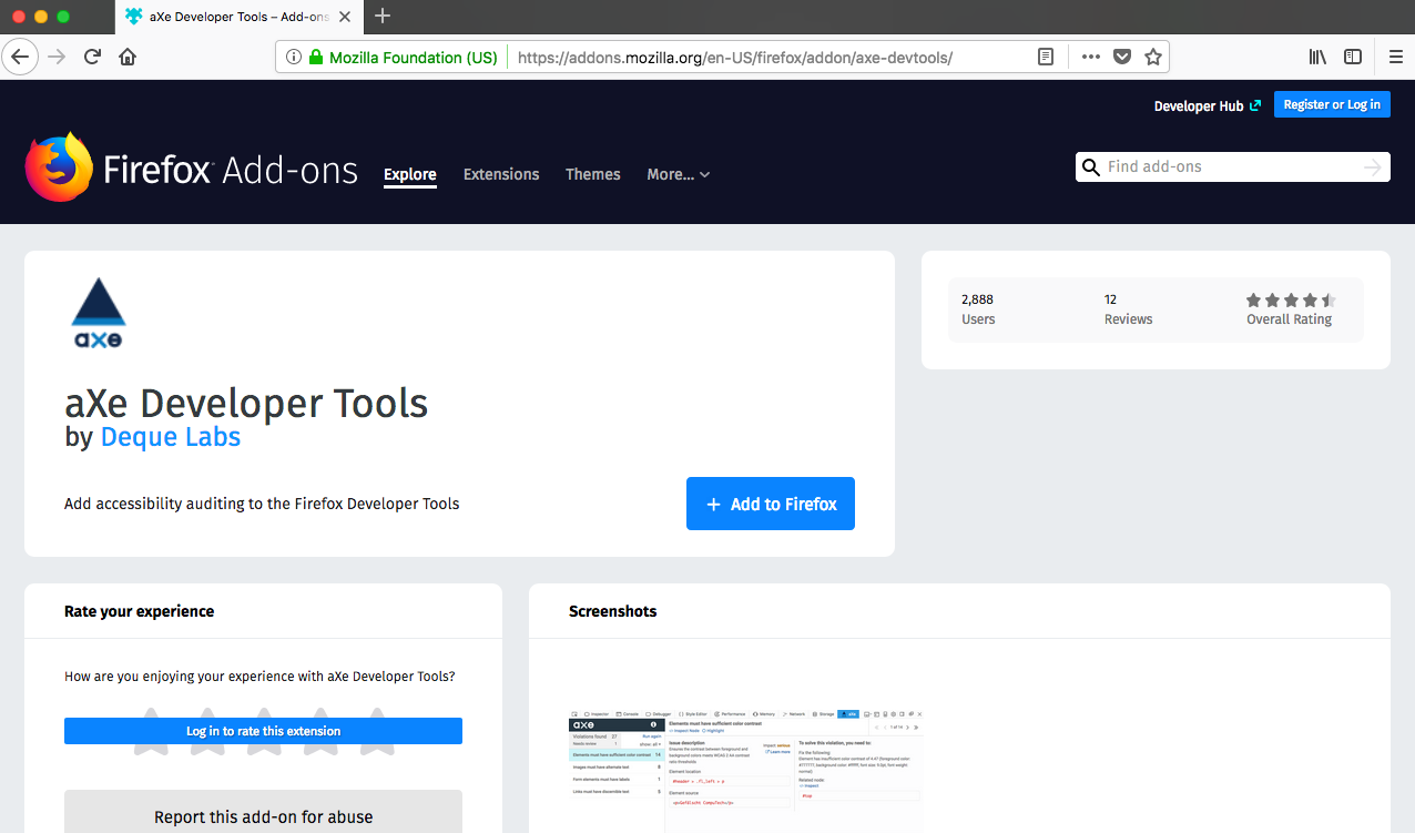
Installation is straightforward. Start by navigating to the download page for the extension (here’s the flow for Firefox):
1. Click on the Add to Firefox button.
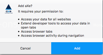
2. Give aXe permission to be added as an extension.
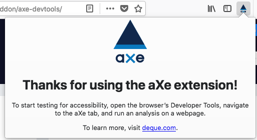
3. After installation completes, this confirmation screen will appear.

4. Depending on how many add-ons you have, you will see something similar to the following on your Firefox browser toolbar.

5. Click on the aXe icon to get a help message. aXe is part of Developer Tools and appears within that context.
If your installation went correctly, you should see the following. Click on the aXe navigation bar header to see the screen below. If you see this, you are good to go.

Press the “Analyze” button on your chosen web page. I might as well pick on myself. Let’s have a look at http://mkltesthead.com/.
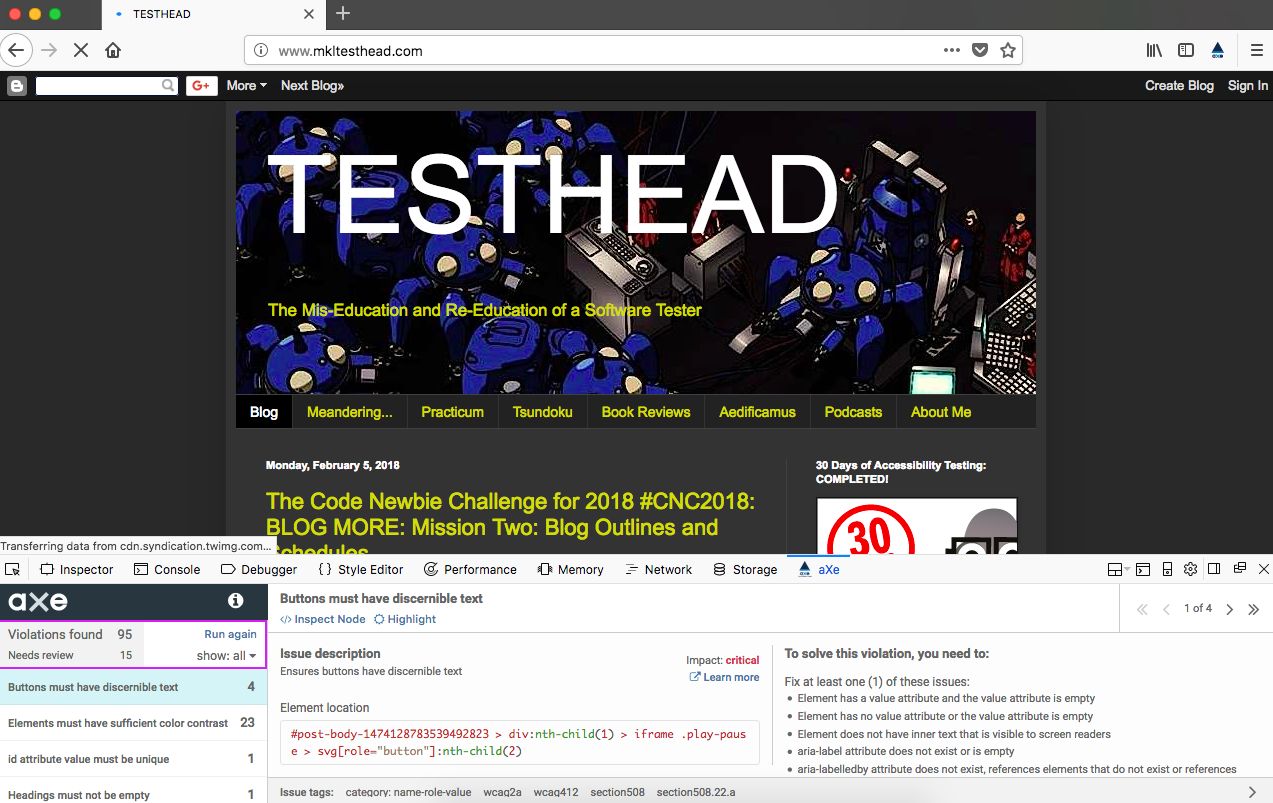
See that output at the bottom? That’s an indication that I have some stuff to deal with.
I hear you saying, “well, OK, that’s… interesting… what exactly am I looking at here?”
A First Pass at your aXe Analysis
aXe gives the user a condensed listing of issues found. Let’s take a look at the listing in more detail:
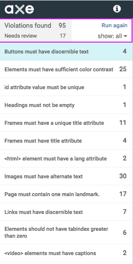
The top section displays the number of Accessibility violations (in this case, 95 of them). The listing below the violations count is an area that says “Needs review”. These are potential violations, but they may not be. Let’s take a look at one of them:
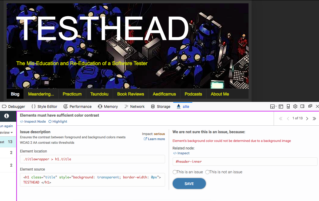
We can see the issue. The validator cannot actually determine if the color contrast of the title is compliant. The reason is that there is an image beneath it, and that image has varying shades, where in some areas there is definitely a bold contrast, but in a few areas, the “whites of the Tachikoma’s eyes” are right next to the text. Below the issue description is the actual code that is being evaluated.
In this case, I have two choices. I can either tell the system that this is not an issue and move on, or I can consider how to match both the letter and spirit of the issue and fix it. Options are I could remove the image, or I could darken the image significantly so that all areas are in sharp contrast.
Additionally, I can do some sleuthing through the tool by clicking on the “Learn more” link next to the description. I can also click the “Inspector” link and see the element in context with the surrounding code for the page:
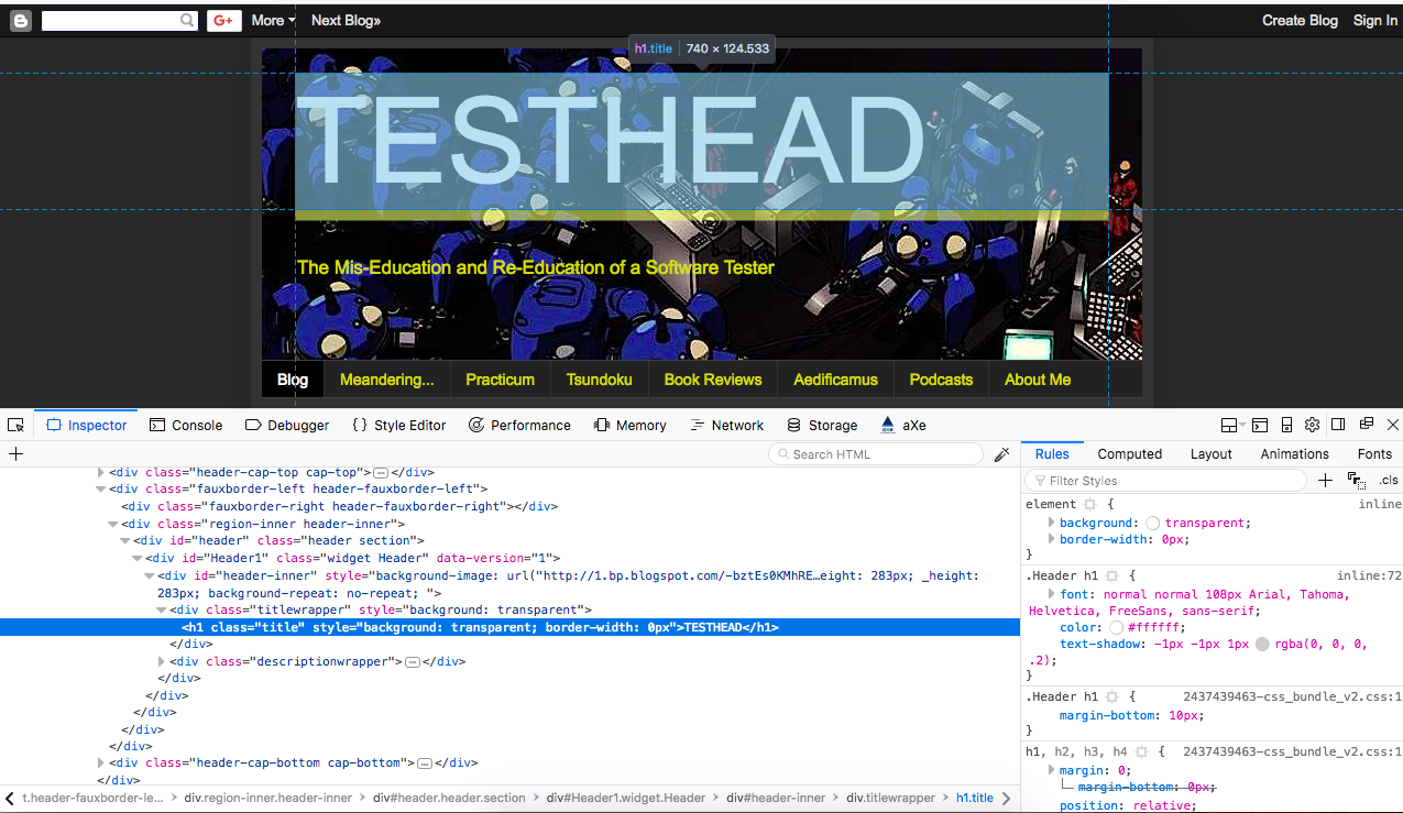
Having given the code a once-over, I can now (if I choose) make a decision for a course of action. In this case, I am going to make the executive decision to leave the image as it is and say that it is “not an issue” because, for 97% of the text, there is ample contrast.
By selecting “This is not an issue” and clicking the “Save” button, I update the aXe database and move on to the next issue that needs review.

If you followed along, that should give you some feel for how you can quickly use aXe to validate a number of Accessibility issues on your chosen page. There's plenty more where that came from, to say the least, and I will be getting into more details in future posts, both with aXe and a few other favorite Accessibility tools.
3. After installation completes, this confirmation screen will appear.
4. Depending on how many add-ons you have, you will see something similar to the following on your Firefox browser toolbar.
5. Click on the aXe icon to get a help message. aXe is part of Developer Tools and appears within that context.
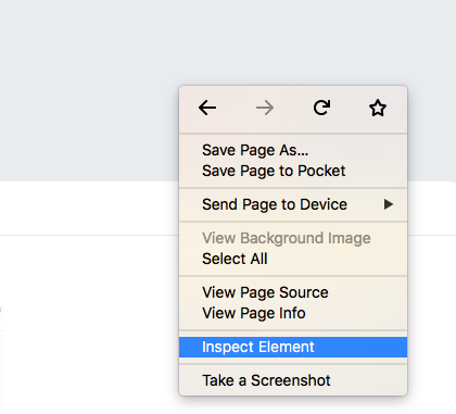
My preferred way to open Developer tools is to just click anywhere in the browser main window, right click, and then select “Inspect Element”.
If your installation went correctly, you should see the following. Click on the aXe navigation bar header to see the screen below. If you see this, you are good to go.
Press the “Analyze” button on your chosen web page. I might as well pick on myself. Let’s have a look at http://mkltesthead.com/.
See that output at the bottom? That’s an indication that I have some stuff to deal with.
I hear you saying, “well, OK, that’s… interesting… what exactly am I looking at here?”
A First Pass at your aXe Analysis
aXe gives the user a condensed listing of issues found. Let’s take a look at the listing in more detail:
The top section displays the number of Accessibility violations (in this case, 95 of them). The listing below the violations count is an area that says “Needs review”. These are potential violations, but they may not be. Let’s take a look at one of them:
We can see the issue. The validator cannot actually determine if the color contrast of the title is compliant. The reason is that there is an image beneath it, and that image has varying shades, where in some areas there is definitely a bold contrast, but in a few areas, the “whites of the Tachikoma’s eyes” are right next to the text. Below the issue description is the actual code that is being evaluated.
In this case, I have two choices. I can either tell the system that this is not an issue and move on, or I can consider how to match both the letter and spirit of the issue and fix it. Options are I could remove the image, or I could darken the image significantly so that all areas are in sharp contrast.
Additionally, I can do some sleuthing through the tool by clicking on the “Learn more” link next to the description. I can also click the “Inspector” link and see the element in context with the surrounding code for the page:
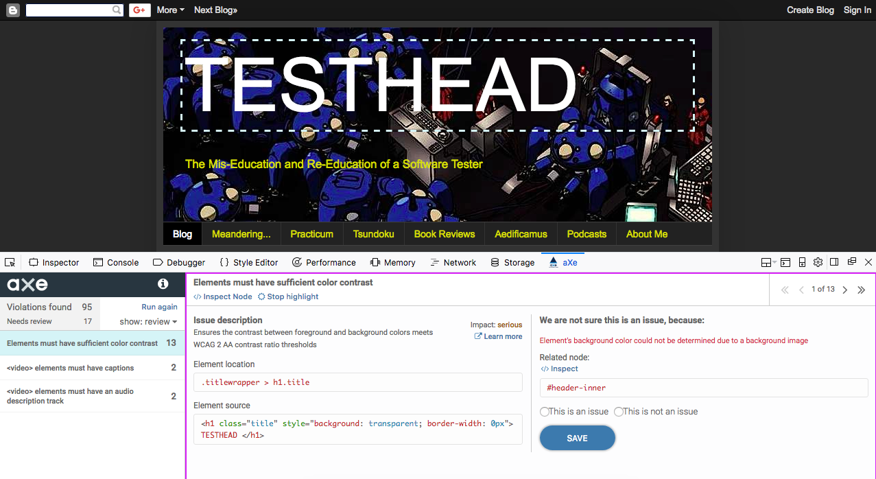
Clicking on “Highlight” will focus on the element in question but leave us with the review screen:
Having given the code a once-over, I can now (if I choose) make a decision for a course of action. In this case, I am going to make the executive decision to leave the image as it is and say that it is “not an issue” because, for 97% of the text, there is ample contrast.
By selecting “This is not an issue” and clicking the “Save” button, I update the aXe database and move on to the next issue that needs review.
If you followed along, that should give you some feel for how you can quickly use aXe to validate a number of Accessibility issues on your chosen page. There's plenty more where that came from, to say the least, and I will be getting into more details in future posts, both with aXe and a few other favorite Accessibility tools.