Friday, May 26, 2017

Spread the Word: 30 Days of Accessibility Testing

The Ministry of Testing has declared that May should be "30 Days of Accessibility Testing". As in the days of yore when I used to take on these challenges and blog regularly, I'm in the mood to get back to doing that. Therefore, I am looking to write a post every day around this topic and as a way to address each line of their checklist.

26. Find an accessibility issue on a website, and report it.

Since Blogger is my tool of choice for hosting TESTHEAD, it seems only fitting that I look to it to see what I can do to help improve its ability to be a better accessible platform or, barring that, at least accessible as far as what I can actually do to enhance it.

Using WAVE, the following error was the first to pop out:

Errors
Document language missing

What It Means

The language of the document is not identified.

Why It Matters

Identifying the language of the page allows screen readers to read the content in the appropriate language. It also facilitates the automatic translation of content.

How to Fix It

Identify the document language using the attribute (e.g., ).

The Algorithm... in English

The attribute is missing or is empty.

The nice thing about Blogger is they have a "Send feedback" button in the lower right-hand column for the Dashboard, so submitting issues is easy, as well as with screenshots.

Curious to see if in the future we see this enhanced :).

Thursday, May 25, 2017

Shapes of Things: 30 Days of Accessibility Testing

The Ministry of Testing has declared that May should be "30 Days of Accessibility Testing". As in the days of yore when I used to take on these challenges and blog regularly, I'm in the mood to get back to doing that. Therefore, I am looking to write a post every day around this topic and as a way to address each line of their checklist.

Taking a brief moment in this post to reflect on a milestone. Thank you to everyone who reads TESTHEAD. This morning, my one millionth visitor came to this site. I wish I could figure out who that person is, but regardless, I want to say thank you to everyone who has come here over the years, whether it be one time or repeat reading.

25. Explore W3C’s Before and After Demonstration

The subtitle for this page is "Improving a Web site using Web Content Accessibility Guidelines (WCAG) 2.0", and I have to say, this is a nice little resource to see because it gives you some concrete examples of what you could/should do to make a site accessible.

Here are two pictures of the home page they use for their example (there are several pages with before/after examples). 

Before picture of the W3C example site
Here's the "Before" picture example. Notables are the headings for the pictures and the phone number at the bottom only using a hip word spell out.

After picture of the W3C example site
Here's the "After" picture example. Other than some cosmetic variations on the layout, notable changes are having more meaningful headers for the image blocks, and the phone number displays both the digital version and the lettered mnemonic.

What' nice about this example is that you can put the two pages side by side in two separate browser windows and just by looking at the two, you can see why the After picture would be preferable.

If, however, you want to see what can be improved and what was applied in greater depth, each page has annotations to show exactly what needed to be changed and what change was applied. The top nav bar can quickly toggle between Before/After to see what has been changed. 

If you have been curious as to see how cumulative changes can be applied and the rationale behind what they are, then have a look at the Before and After simulation.

Wednesday, May 24, 2017

What is the Law? 30 Days of Accessibility Testing

The Ministry of Testing has declared that May should be "30 Days of Accessibility Testing". As in the days of yore when I used to take on these challenges and blog regularly, I'm in the mood to get back to doing that. Therefore, I am looking to write a post every day around this topic and as a way to address each line of their checklist.

24. Learn about accessibility law in your country.

I live in the U.S.A., and therefore, while WCAG 2.0 is the guidelines I aim for, we usually refer to "Section 508" or features being "508 Compliant" because that is a section of the Rehabilitation Act of 1973. Actually, there are two areas in the Rehabilitation Act that relate to disabilities. The first is Section 504, which declares that the act "prohibits federal agencies, programs, or activities from discriminating and requires reasonable accommodation for qualified individuals with disabilities." Section 508 declares that "agencies must give disabled employees and members of the public access to information that is comparable to access available to others." A basic checklist of Section 508 compliance can be seen by clicking on the link.

Notice anything interesting there? Did you see anything mandating that Accessibility is the law everywhere? Nope. Just in the services and the fund allocated for them by the federal government. Is there a strict standard? Again, nope, but Section 508 by virtue of being a policy of the federal government, and with the sheer volume of software seats that the federal government provides, can carry a lot of weight in regard to the design decisions of companies.

I know for a fact that a large agency of the federal government looking to purchase a lot of software from my company was what initiated a thorough review of Accessibility requirements and areas that needed to be updated in our product so that they would buy it. The dollar amount of that deal most certainly played a part in why we undertook a large-scale retrofit of our product to meet Accessibility standards, and again, the standard we measured for that purpose were the guidelines as described to meet U.S. requirements. To meet the broader WCAG 2.0 requirements means we still have a distance to travel still.


For a nice breakdown of what USA Laws do and don't cover, see http://webaim.org/articles/laws/usa/


Tuesday, May 23, 2017

Mental Hopscotch: 30 Days of Accessibility Testing


The Ministry of Testing has declared that May should be "30 Days of Accessibility Testing". As in the days of yore when I used to take on these challenges and blog regularly, I'm in the mood to get back to doing that. Therefore, I am looking to write a post every day around this topic and as a way to address each line of their checklist.

23. Find missing semantic information (e.g. headers, landmarks, links, and buttons).


Yesterday, we had a look at Semantic HTML and what it is. Today, let's take a look at how well my blog actually uses it (yep, we're picking a fight with TESTHEAD once again :) ). That means, indirectly, I'm also calling out Blogger as to the way it lays out its pages since TESTHEAD is hosted on Blogger.

As I open the source and try to see what each page would be showing me, the fact is, most of the layout for Blogger is not using Semantic HTML in any easy to see manner. Almost everything is a div, with a hierarchy in CSS that is a bit hard to decipher on first glance.


an example of page source showing the DIV's used to construct the page layout.
A quick look at the div listings. They are named, but not using the examples highlighted yesterday.

Here's a look at the navigation section, which does use a header tag:
View Source showing the TESTHEAD navigation links


Granted, Blogger is a template system, and there is a lot of manipulation required to make those templates work with individual customization, so a semantic design may be difficult to pull off, but I wonder if I could work some of the options into my individual posts. I will give it a try tomorrow for comparison.

Monday, May 22, 2017

In a Manner of Speaking: 30 Days of Accessibility Testing


The Ministry of Testing has declared that May should be "30 Days of Accessibility Testing". As in the days of yore when I used to take on these challenges and blog regularly, I'm in the mood to get back to doing that. Therefore, I am looking to write a post every day around this topic and as a way to address each line of their checklist.

The song title puns continue, but this was a stretch. I know this one from Martin Gore, but it's a cover of a Tuxedomoon song. You're welcome ;).

22. Learn why semantic HTML is important.

Put simply, Semantic HTML goes beyond the literal markup of an HTML page and uses tags that have meaning in and of themselves.

To borrow from W3Schools explanation of semantic elements:

A semantic element clearly describes its meaning to both the browser and the developer.

Examples of non-semantic elements:  "div" and "span"  - Tells nothing about its content.
Examples of semantic elements: "form", "table", and "article" - Clearly defines its content.

Examples of Semantic HTML elements as seen on W3Schools site.
Examples of semantic HTML elements (W3Schools).

HTML 5 has taken this a step further by making it possible to structure documents by using more readily understandable terms. Tags such as "article", "aside", "details", "footer", "header", "nav", "progress",  "mark", and "time" all give clues as to what the element is meant to represent, much more quickly than a general "div" or "span" will tell you.

By using Semantic markup, we don't just make pages that are easier for users to understand, we make pages that are easier for developers to understand as well.

Sunday, May 21, 2017

I Feel Like I'm Invisible: 30 Days of Accessibility Testing

The Ministry of Testing has declared that May should be "30 Days of Accessibility Testing". As in the days of yore when I used to take on these challenges and blog regularly, I'm in the mood to get back to doing that. Therefore, I am looking to write a post every day around this topic and as a way to address each line of their checklist.

Bad song lyric puns continue, with apologies to Alison Moyet ;).


21. Look for invisible keyboard focus when tabbing through a page.

First of all, what exactly is that? It means that we have spots on the page that do not allow us to select items or don't give us any indication as to where on the page we actually are. 

Here's a quick example. Since I figure it's only fair to call out stuff that is mine or that I actively use, let's look at the TESTHEAD site again.

If we look at the first picture, we see that I have tabbed over the element that features the Twitter link. As you can see, it has a highlight around it to show the keyboard focus being over that element:


Let's press the tab three times so that we can highlight the G+ element:


Notice anything interesting? The G+ element has no highlight around it. Let's see what happens when we turn on VoiceOver:


VoiceOver creates its own keyboard focus element, and we see/hear the words stated when we are tabbing through the document. Turn off VoiceOver and there's no indication that G+ is selected. If we press Enter while we have tabbed to the G+ element, even if we don't see the highlight, the element is where the keyboard focus is, so pressing Enter brings up the G+ dialog.

There you go, a simple example. You might be saying "OK, but so what. Just turn your screen reader on and problem solved." Do you want to have a screen reader on all the time? If you aren't a person with low vision but have a motor disability, do you want to hear that voice all the time? More to the point, what if you look away for a bit and need to get back to the keyboard, do you know where you are? Sure, you can Shift+Tab and then Tab again to get back to where you are (a process I do very frequently for this very purpose), but it's not something I look forward to. Plain and simple, if we have an option to highlight where we are on the page, do so. If something doesn't get highlighted that should be, raise attention to that fact. 


Saturday, May 20, 2017

Checking the List: 30 Days of Accessibility Testing

The Ministry of Testing has declared that May should be "30 Days of Accessibility Testing". As in the days of yore when I used to take on these challenges and blog regularly, I'm in the mood to get back to doing that. Therefore, I am looking to write a post every day around this topic and as a way to address each line of their checklist.

20.  Write a Simple Accessibility Checklist

I don't like claiming work as my own that I've used from other sources, so I'm going to level with you. My checklist has already been compiled and it's here:

https://www.wuhcag.com/wcag-checklist/

Why this list? I like it because it takes Accessibility in three tiers (A, AA, and AAA, or Beginner, Intermediate and Advanced). To borrow from Wuhcag's page:

"Wuhcag is all about holistic web accessibility – that means taking everything about your website into account. That’s why I don’t rush you to make every web accessibility change at once – it’s too much for you to do and so it’s bad for your users. I love a structured approach to everything in life, and your website is no exception."

Each level allows the user to consider a broad range of "what if" questions. Many of these could be automated, but many of them definitely need some personal observation. Remember, it's not enough to say that a site is "compliant". It's more important that the site is usable and can provide an experience for the end user that would be comparable or in line with what a normative user would experience.

Does that sound like a challenge? It certainly is, and it means that there will be lots of opportunities for human interaction for at least the near future. Not sure what to look for or where to direct your efforts. The above three checklists are certainly good places to start.

Some Cool People To Follow on Twitter: 30 Days of Accessibility Testing

The Ministry of Testing has declared that May should be "30 Days of Accessibility Testing". As in the days of yore when I used to take on these challenges and blog regularly, I'm in the mood to get back to doing that. Therefore, I am looking to write a post every day around this topic and as a way to address each line of their checklist.

19. Find 5 accessibility experts to follow on Twitter.

1. Albert Gareev (@AGareev): Albert and I have been friends/compatriots/writing partners/co-presenters for seven years when I made the commitment to get more involved in the testing community in the first place. It turned out that Albert was also actively involved in Accessibility, and thus, when I started working on it as part of my work, Albert became a lifeline of ideas and encouragement. We've worked on several things together, and the "HUMBLE" mnemonic is rightly his, though both of us present it.

2. Alicia Jarvis (@AJarvis728): Alicia has likewise been active in the Canadian Accessibility community along with Albert, and has been a source of advocacy, passion and focus that I've reached out to many times. My first association with Inclusive Design and thinking about it was because of her tweets and advocacy.

3. Ellen Parfitt (@deafieblogger): Ellen is a new one for me, in that I came across her work during this challenge. Her site HearingLikeMe.com has a lot of great insights dealing with hearing loss and working with technology to enhance the experience for those with hearing loss (both primary and incidental).

4. Neil Milliken (@NeilMilliken): Lots of stuff I could point to for Neil, but the AXS Chat Community is a good enough place to start :).

5. Alice Boxhall (@sundress):
 Another recent discovery during this 30 days challenge. I've enjoyed learning about her and the initiatives she takes part in.

There are of course much more, but if I were to name all of them, we'd be here all day. Start with these five, read what they have written and commented about, and who they interact with. My guess is you'll discover a lot of people worthy of your time and attention.

Thursday, May 18, 2017

A Certain Shade of Green: 30 Days of Accessibility Testing

The Ministry of Testing has declared that May should be "30 Days of Accessibility Testing". As in the days of yore when I used to take on these challenges and blog regularly, I'm in the mood to get back to doing that. Therefore, I am looking to write a post every day around this topic and as a way to address each line of their checklist.

18. Use a tool to test for colour contrast problems.

It seems I'm giving WebAim a lot of love this month, and there's a reason for that. They do a good job of taking Accessibility concepts and breaking them down into hands-on tools that a user can play with to understand what they are looking at and ways to play how-to scenarios with them. WebAim's Color Contrast Checker fits squarely into that niche as well.


The Color Contrast checker needs two values, a background color & a foreground color. You can choose any of the hex values that make up a color code and either enter them into the two text boxes provided, or you can enter them into the URL directly like so:


The resulting screen will display the values, and then give you options to lighten or darken the foreground and/or background, and see both the Contrast Ratio as well as what the contrast would look like on a page if it were used.

As we can see, that's not a really good ratio, and that would be hard to read even for normative vision users. 

Let's adjust those values to something a little more reasonable, shall we?

By clicking the Lighter/Darker links, we can change broadly the shade that is selected. By clicking on the actual text box, we can bring up a color picker and choose a color that we like:


The color picker gives you two regions. One gives a large selectable color palette, and the other provides an arrow slider so you can select the level of saturation for that hue. Regardless, the end result is a hex value that is represented in the corresponding text box. With that, you can see if your contrast level passes, and the contrast ratio value.

What's this useful for? If you are responsible for reviewing CSS or otherwise determining contrast levels for text, backgrounds, widgets, etc. This allows you to look at corresponding colors, experiment with variations, and see what works both aesthetically and numerically. Granted, it's not going to let you look at your pages directly (there's other stuff for that, and I'll post links later in the challenge) but for now, if you want to get your feet wet, here's a good place to start.


Wednesday, May 17, 2017

What Are Words For? 30 Days of Accessibility Testing

The Ministry of Testing has declared that May should be "30 Days of Accessibility Testing". As in the days of yore when I used to take on these challenges and blog regularly, I'm in the mood to get back to doing that. Therefore, I am looking to write a post every day around this topic and as a way to address each line of their checklist.

17. Find a problem that might affect someone with dyslexia.

I have to confess, I struggled with trying to understand this before this month's challenge. That's often the case with normative users in regards to [fill in the blank] normativity. It's one thing to try to empathize, but the frustration just isn't as easy to relate to if you don't have a point of reference. Vision problems weren't frustrating until I developed my own near-sightedness due to advancing age and determined that my readers were much more than a handy fashion accessory, they were essential to my daily operating. Hearing loss I have a little bit more to work with, as I have approximately 30% hearing loss from a decade-plus playing loud music (kids, wear earplugs when you rehearse and perform).

Dyslexia I struggled with trying to understand because reading is one of my big loves of life. I've never struggled with reading for comprehension and so I wasn't sure how to really internalize this one. Then WebAim decided to put something together to both humiliate me and make me see a problem anew, as well as what I could do about it.

First, let's talk humiliation... WebAim has a dyslexia simulation you can run on yourself.


Through a basic introduction to some of the hallmarks of dyslexia (letter reversals, word reversals, inversions, transpositions, word confusion and spelling inaccuracy) there's a lot to consider when looking at dyslexia symptoms and then realizing there is no "one size fits all" option. Each person has a differing set of symptoms and degree of severity of some over others. Still, we have to start somewhere, so how about here:


So... how did you do? Truth be told, it took me three read-throughs, and a bit of de-focusing to be able to get that to flow together to understand it. After the read through, it asks you two questions. I'll let you all go there and see if you can answer them, but basically, there are several things we can do to improve the readability of pages (and several modifications I should be making to my own blog here):

Consistent Navigation and a spare layout help a great deal with a predictable and easier to comprehend interface. Nesting and sub listings are not helpful and could potentially cause a dyslexic reader to lose track of where they are and what they are doing.

Chunk text and pictures in a way that makes the process of reading a site less daunting. I admit I'm guilty of this because I have a tendency of being a wordy fellow. Grouping text under logical headings and making more use of bold section lines to differentiate various sections would be a big help.

Context Matters, and therefore, if pictures can help you tell your story or make a point/help achieve an objective, by all means, use them.


Consider how your page would look if it were printed. People with dyslexia may wish to print off a page to read it in their own time and at their own pace.

Allow the user to control the layout and size of media they see, where possible.

As in the other posts about "find a problem" that holds true again, is that the simpler and cleaner we make an interface, and as we structure our pages to be modular, small amounts of text grouped in areas with titles that stand out, we improve the experience for those with dyslexia and for those who don't have it. Simple and spare design helps improve the usability for everyone, so design with that in mind up front :).


Tuesday, May 16, 2017

When You Can't Get a Grip: 30 Days of Accessibility Testing

The Ministry of Testing has declared that May should be "30 Days of Accessibility Testing". As in the days of yore when I used to take on these challenges and blog regularly, I'm in the mood to get back to doing that. Therefore, I am looking to write a post every day around this topic and as a way to address each line of their checklist.

Yay! I'm all caught up :).

16. Find a problem that might affect someone who can’t use their hands.

This is a broad range of issues that falls under the umbrella term "motor disabilities" and can have many possible causes. We can be talking about the limited use of limbs due to paralysis, deformities, prosthetics, and in cases where there is no limb to use. Due to these limitations, there are several instances that can be looked at as barriers to interacting with technology, as well as a number of devices that can help with overcoming those limitations. 

I remember as a child seeing a news program that celebrated a local resident who had lost the use of her arms due to an accident. She was a talented artist, and rather than give up her skills, she trained herself to use her mouth and her head movements to replace the motor control that her arms and hands used to provide. Yes, for those curious, she resumed painting by holding a paintbrush in her mouth. In many ways, that analog is used today by many with motor disabilities, where the head and neck, eyes, chin, and mouth are utilized to make up for the loss of hands as primary input devices.

WebAim has a page that is dedicated to assistive technology alternatives for those with motor disabilities. These range from simple sticks that can be held in the mouth to adaptive keyboards and large trackball mouse devices to speech recognition software. As someone who does a lot of typing throughout the day, I would find it particularly challenging to try to interact with a computer system sans the ability to type. Voice recognition software can come to the rescue, but that's also provided that you have a clear enough speaking voice to be able to control the software to respond correctly and effectively.

Have we noticed a trend in these past few posts? In all of them, I could make some specific recommendations, but there's one that stands out as near universal. Systems that are simply designed, with a minimum of clutter, are going to work better for anyone with a significant disability. What's more, a simpler and cleaner design will not just help those with disabilities but will be more helpful to everyone. Also, the last big takeaway from the motor disabilities page is that most devices mimic or interact with a keyboard so we would do well to make our products as keyboard friendly as we can, and in the process, require as few keystrokes as possible to accomplish the tasks we need to.

In Sharper Contrast: 30 Days of Accessibility Testing

The Ministry of Testing has declared that May should be "30 Days of Accessibility Testing". As in the days of yore when I used to take on these challenges and blog regularly, I'm in the mood to get back to doing that. Therefore, I am looking to write a post every day around this topic and as a way to address each line of their checklist.


I was away much of this past weekend, so I'm going to need to double up a couple of entries for a few days to catch back up. Thank you for your patience :).

15. Find a problem that might affect someone who is colourblind.

I have actually had a chance to interact with one of my scouts over the course of the past few years who is color-deficient and who has shown me several times how some sites are difficult for him to read because of the lack of contrast. His particular color-deficiency is called Protanomalia, so he has difficulty with seeing red or colors in the red spectrum, but it's not as pronounced a deficiency as Protanopia, which is a virtual loss of red perception. Still, even with a red deficiency, that often makes sites or apps that use red and that use colors that overlay the red as difficult to see. Thus, for me, the takeaway is that contrast is more desirable than aesthetic sense. 

I recently went back and looked at my blog and noticed that the gray to white contrast was not very strong, and after playing with my site in some color contrast tools, I decided to up the contrast and trade out orange elements for a brighter yellow hue. this matched wth white text on a dark gray background passes the first level of contrast, but I still have some issues regarding higher end contrast. 

Anyway, enough of my blathering. You probably wondered if I'd provide a resource that could help you look at color and color deficiency in a different way, right? Here's hoping I deliver on that promise. Visibone has a page dedicated to "Color Deficient Vision" and some examples to help you make choices regarding colors and color contrasts.


We're Not All Ears: 30 Days of Accessibility Testing

The Ministry of Testing has declared that May should be "30 Days of Accessibility Testing". As in the days of yore when I used to take on these challenges and blog regularly, I'm in the mood to get back to doing that. Therefore, I am looking to write a post every day around this topic and as a way to address each line of their checklist.


I was away much of this past weekend, so I'm going to need to double up a couple of entries for a few days to catch back up. Thank you for your patience :).

14. Find a problem that might affect someone who is deaf.

I've already addressed this somewhat with talking about how The Testing Show offers transcripts of our shows, but I wanted to think about this a bit deeper. I mean, that's great and all, but am I really looking at a big picture here? How else are we inadvertently not allowing those who are deaf to completely take advantage of the web and mobile apps?

In my poking around, I found "5 ways to make websites more accessible for deaf people", and in it, they list a few areas I really hadn't considered, i.e. they go outside of what I typically think about:

If your contact info doesn't have multiple options, or you just list a phone number, that's certainly going to be a problem for a deaf/hoh person. In this day and age, it may seem odd to not include an email, but many sites don't. The more options allowed that let people see and type in their inquiries, the more likely they will interact with you.

Subtitle/caption for videos: Seeing as I am currently creating a podcast that uses YouTube as a delivery mechanism, it's pretty nice to see the Closed Captioning option and how it works. It misspells my name, but I'm used to that ;). Other than that, that's a great plus, so if you want to use YouTube for video content, their CC option works well.

Using Simple English, or doing our best to make our message as clear and consistent as possible makes it possible for ASL communication to be less fragmented. Keeping it simple becomes even more important for people who may not consider English their first language (i.e. ASL would be).

Using Social Media channels to help communicate is a new one for me. I hadn't considered that using services like Facebook or Twitter, by the developed familiarity that people have with those platforms, can help amplify a message or a service by using the social platform paradigms.

Streamlining Navigation is a big plus for users who are blind or with low vision, but deaf/hoh users likewise benefit from a simple to navigate site. This is an example of Inclusive Design ideas coming into the discussion, where principles for one community can help make services more usable by everyone.

My thanks to Ellen Parfitt for the original post and some things to think about :).


Monday, May 15, 2017

Watch and Learn: 30 Days of Accessibility Testing

The Ministry of Testing has declared that May should be "30 Days of Accessibility Testing". As in the days of yore when I used to take on these challenges and blog regularly, I'm in the mood to get back to doing that. Therefore, I am looking to write a post every day around this topic and as a way to address each line of their checklist.

I was away much of this past weekend, so I'm going to need to double up a couple of entries for a few days to catch back up. Thank you for your patience :).

13. Watch a video about accessibility and share with someone.


There are several videos about Accessibility out there, but several of them come with an ask for email or phone number to view them. I decided I wanted to make a selection that would be available to as many people as possible without needing to register or get on a mailing list. Not that there's anything wrong with companies wanting to get information this way, but I'm choosing not to do that this time around. 

This is a talk given by Alice Boxhall about Accessibility Testing, specifically focusing on a number of Accessibility testing tools. From the YouTube comment listing:

Published on Jan 17, 2014
Presenter(s): Alice Boxhall
URL: https://lca2014.linux.org.au/schedule...

"This session will introduce some open-source tools and techniques that have been used over a variety of projects to identify accessibility regressions. It will focus on tools that can be used in the browser itself and on automated testing strategies that enable developers to quickly iterate and improve their code. Though automated tests will never catch every regression, a common-sense approach that focuses on the most common accessibility problems can help to eliminate the pain of manual testing and make it easier to prevent, catch, and fix accessibility problems."

Have at it. Let Alice know if you found it useful (I'm pretty sure you will :) ).

Friday, May 12, 2017

Accessibility WTAmericas #WTBlitz Session: 30 Days of Accessibility Testing

This is not on the checklist, and in fact, this will be an additional part of the 30 days challenge. As I was working through the checklist, I realized that this would make for a great potential chat session for #WTBlitz, so that's what we will be doing for May.

Details:

On Wednesday, May 17, 207 at 1:00 p.m. Pacific (4:00 p.m. Eastern), we will hold a  one-hour #WTBlitz chat session on Twitter. We have asked Alicia Jarvis to join us as a special guest, and I have also asked additional Accessibility advocates if they would be willing to participate. To be part of it, just use the hashtag #WTBlitz and reply to the Questions posed directly to the threads.

Example, if I were to post:

Q1. Why is Accessibility important, and why should we test for it? #WTBlitz

we would like you to respond directly to the question thread with something like:

A1. [text of answer] #WTBlitz

This will allow us to keep the threads together and gather them for our experience reports and future referencing of answers.

These details will be duplicated on the Weekend Testing website, but I want to use here to get the ball rolling.

Why?

Because I want to see if we can get to what you all out there would find important, pertinent and interesting. To that end, I am going to start compiling a list of questions, and you can ask them/add them here. Likewise, I will encourage anyone who wants to tweet to me questions they would like to ask, and I will update and add the questions to the master list.

To get the ball rolling, here's a starting list of questions:

1. Why is Accessibility important, and why should we test for it?
2. Do you need to specialize in Accessibility to be effective?
3. Is WCAG the best standard to follow?
4. What tools are available to test for Accessibility?
5. If you had to recommend one tool to test Accessibility, what would it be?
6. Can you recommend good tutorial/reference material for Accessibility testing?
7. What is the difference between Accessibility and Inclusive Design?
8. How can I as a tester better advocate for Accessibility/Inclusive Design?

This is a list off the top of my head. They would seem to be natural questions to have a chat about to me, but again, I'm much more interested in what would be interesting to you. If this list is a good enough representation, then great, we'll go with it. If, however, you have better questions or ideas, then please, reply and leave them in the comments section. If the questions you ask are better than the ones listed here, I have no problem bumping these for better questions :).

Tools are not Judges: 30 Days of Accessibility Testing

The Ministry of Testing has declared that May should be "30 Days of Accessibility Testing". As in the days of yore when I used to take on these challenges and blog regularly, I'm in the mood to get back to doing that. Therefore, I am looking to write a post every day around this topic and as a way to address each line of their checklist.

12. Read an article about accessibility and share it with someone.

There's a lot of benefits that we can get from automation. It sequences a lot of repetitive tasks. We can run thousands of steps the same way or in random ways, over a period of time, that would drive a person insane. It lets us create assertions to see if an element is present or not. No argument from me, there's a lot of good stuff that automation does. However, there are a few things that automation does not do well, and I have mentioned this in the past with talks I have given. One of the areas I've commonly stated as lacking by automation is that it cannot make a judgment call. 

Karl Groves article "Automated Web Accessibility Testing Tools Are Not Judges" takes a similar stance. Here's an example that I feel provides a nice commentary on that:

"One thing that is missing across all automated testing tools, is contextual understanding. Automated accessibility testing tools provide the ability to test against highly specific heuristics that are very tightly scoped. They have no insight into the broader document being tested. They have no ability to determine the specific purpose of the page as a whole. I have been present at usability tests where test scenarios failed because of one highly important technical failing that – within its own context – was relatively minor. Nevertheless, it caused all participants to fail the test scenario."

[...]

we can’t even definitively prove conformance with any given WCAG SC, so grading any specific SC as a “pass” is wholly impossible. This is important to consider, because it means that even if your tool of choice returns zero errors, you can still be non-conformant. A picture of a dog, with an alt attribute of “cat” will pass all automated accessibility tools, despite being completely inaccurate even in terms of what is displayed in the image."

I encourage everyone to read Karl's article, as it has some great food for thought.


Thursday, May 11, 2017

Out Go The Lights: 30 Days of Accessibility Testing

The Ministry of Testing has declared that May should be "30 Days of Accessibility Testing". As in the days of yore when I used to take on these challenges and blog regularly, I'm in the mood to get back to doing that. Therefore, I am looking to write a post every day around this topic and as a way to address each line of their checklist.

11. Turn your screen off and rely on a screen reader.

This is going to be a short entry. Why? Because I'm writing it entirely in the dark. My screen reader is telling me where I am, and I am not hearing back what I type, so I'm tabbing back and forth to hear what I've written. It's one thing to use a screen reader for testing, but it's entirely different to really have to rely on it. 

It takes me a long time to type out just these short sentences, and then wait to hear them back to hear what I actually wrote. Also, if I get frustrated enough, I can always go back and turn the screen on to see where I am. For those who are truly sightless or have a significant visual impairment, that's not an option.

If you have the opportunity to use VoiceOver or NVDA, seriously, try this challenge out. Don't be surprised to find out how frustrating it can be, and then remember, if you have normative vision, you can always turn the screen back on.

Wednesday, May 10, 2017

Bend Your Reader To Your Will: 30 Days of Accessibility Testing

The Ministry of Testing has declared that May should be "30 Days of Accessibility Testing". As in the days of yore when I used to take on these challenges and blog regularly, I'm in the mood to get back to doing that. Therefore, I am looking to write a post every day around this topic and as a way to address each line of their checklist.

Day 10. Let's do this.

10. Test with a screen reader and share one useful tip.

Most of my day to day work the past few years has been done on a series of MacBook Pro devices. I use PCs in our test lab and I have an embarrassingly old Windows laptop that runs Windows 7 still for testing old stuff, but I use a Mac for 90% of my day to day stuff. Therefore, I utilize VoiceOver as my go to screen reader. My company uses JAWS as a commercial screen reader tool, and NVDA is a free screen reader for Windows. Since I'm dialed in for Mac at the moment, this tip is going to be about VoiceOver. At a later time, I will do some side by side comparisons of other screen readers for other platforms.

Apple has a pretty good tutorial/guide for using VoiceOver on their site, but I want to highlight a feature that I think is pretty helpful, and that's VO key locking. VO is a shorthand for the VoiceOver Modifier. By default, VO is the [control] and [option] keys pressed together. Thus, when you see reference to commands like "VO+h", that's simply "[control]+[option]+h". This command opens up the VoiceOver Help menu.


By typing "VO-;", you can lock the VO Modifier keys. This means that you can enter VoiceOver key commands without having to press the VO combination while it is turned on.

With the locking on, if I want to open the help menu again, now all I have to do is type "h".

By entering the same command, "VO-;" we can unlock the modifier.

It's a simple trick, and if you are used to the VO combinations, maybe not something you need, but I find it nice when I'm actively interacting with the screen reader to not have to use multiple key combinations each time.

BONUS TIP: This is a totally tangential use of VoiceOver, but you can use it as a "proofreader" for anything you type. We have a tendency to skip over our own typos, as well as grammatical lapses, but VoieOver will read through it with a steely resolve, and misspelled words jump out, as well as clunky grammar. Also, if you are curious as to whether or not you are using "semantic bleaching" with your writing, VoiceOver makes it painfully obvious, like superabundantly obvious ;).

Anyway, go forth, play with VoiceOver, have some fun with it. who knows you might find some interesting uses outside of its intended purpose.

Tuesday, May 9, 2017

Take Away the Pictures: 30 Days of Accessibility Testing

The Ministry of Testing has declared that May should be "30 Days of Accessibility Testing". As in the days of yore when I used to take on these challenges and blog regularly, I'm in the mood to get back to doing that. Therefore, I am looking to write a post every day around this topic and as a way to address each line of their checklist.

All right, post nine for Day 9. All caught up :).

9. Disable images in the browser. Can you understand the page?
Seems the only fair way to do this is to look at my own page again. I think it will be OK, but let's see if I'm good about my design choices:

Testhead Page without Images


Well, on the whole, that's not too bad. Notable things I "see":


There's no indication there's a graphic at the top of the page (my "Tachikoma Interrogation" image is just rendered as a black background. It's decorative, it's an inside joke to readers of my blog, but it's not an essential design element. Alt tag or something indicating what it is would be a plus, but its absence does not have any significant effect on the content of the page.

There are a number of little images that are normally represented as Edit boxes. Now they appear as squares with no content. For a viewer that would not be relevant, as they would not have permissions to edit the page, but if I were the owner and I wanted to make adjustments, the images don't tell me what they represent or why they might matter.

The LinkedIn button has alt text.

The Twitter app that I have embedded has no indication of the images that go with the tweets, but that's not all that important. I care more about the tweets being available and readable than whether or not the pictures are there. Besides, that's out of my control as I don't own the widget code (or do I? Need to look into that).

The On Facebook Widget has been rendered unrecognizable. Again, I don't have control over the widget to the best of my knowledge.

The On Google+ grid just shows a table of squares and no indication what the squares are.

The image showing the cover of Inclusive Design Patters book appears with a descriptive text.

The Social promotion tools are not accessible, they are missing.

Several other images that don't give any indication as to what they are.

Granted, that's just one post. I'm sure if I went far enough back in time I'd find a lot more, but just that one page gives an indication as to how many images creep into pages. Without a way to describe them, or alert individuals that they are decorative and don't add any semantic meaning to the site, it's hard to tell what they are or might represent. Looks like I have some template diving to do to see if I can do something about the number of blank images that appear. If I can't and the widgets are out of my control, then perhaps it's time to consider an alternative way to display that information.

Read All About It: 30 Days of Accessibility Testing

The Ministry of Testing has declared that May should be "30 Days of Accessibility Testing". As in the days of yore when I used to take on these challenges and blog regularly, I'm in the mood to get back to doing that. Therefore, I am looking to write a post every day around this topic and as a way to address each line of their checklist.

Still catching up from the weekend, so this is Day 8, but being posted on Day 9. Later today, I should be all caught up :).

8. Read a book about accessibility.

That's a tall order on any given day, and Accessibility is a big topic, so it's going to be a challenge to get through a book in one day, but it's definitely worthwhile and time well spent to get more familiar with the ideas and principles. With that, I have a few suggestions, and I've even written book reviews for a few of them.

The first book I strongly encourage everyone to read is  "A Web for Everyone: Designing Accessible User Experiences" by Sarah Horton and Whitney Quesenbery. Why do I suggest this one? Lots of reasons, but I really appreciate the depth and level of granularity they used to create personas for testing and relating to issues. This would be a remarkably good book to teach persona based testing as a separate discussion point, but the core of the book is to talk about Accessible user experiences and how to design and test for them. My long-form book review can be read here.

The second book I'd recommend is Katie Cunningham's "Accessibility Handbook: Making 508 Compliant Websites". It's a quick read, but there's a lot to look at and consider. As I stated in my Bottom line for this title "...coming in at 98 pages total, 80 pages of specific content, but don’t let its size fool you. This book will pay for itself with the first usability issues you find.  As you get better, you will be tempted to start creating unique personas for each of the areas, and by all means, do so. The process of seeing how solutions are presented, and how to make changes to those solutions, is well worth the purchase price." My long-form book review can be read here.

The third book I would recommend comes with a caveat, in that it is now ten years old, but don't let that prevent you from still learning a great deal in the process. "Design Accessible Web Sites: 36 Keys to Creating Content for All Audiences and Platforms" by Jeremy Sydik. at the core of this book is the Ten Principles of Web Accessibility, and these are the underpinning for the rest of the book. My long form review can be read here.

Inclusive Design Patterns Book CoverOK, yeah, that's great and all, but you've already read those. What are you going to do now, today? Good question, and unfortunately, it means this entry will be a little incomplete, but I have started reading "Inclusive Design Patterns: Coding Accessibility Into Web Design" by Heydon Pickering.

Of course, I will not be able to finish the entire book and do a review today, but I hereby commit to revisiting this and making a 31st-day entry so I can review the book properly.


Monday, May 8, 2017

The Keyboard Challenge: 30 Days of Accessibility Testing

The Ministry of Testing has declared that May should be "30 Days of Accessibility Testing". As in the days of yore when I used to take on these challenges and blog regularly, I'm in the mood to get back to doing that. Therefore, I am looking to write a post every day around this topic and as a way to address each line of their checklist.

This is my second entry for May 8, since I was away for the previous weekend. This brings me up to "day 7":

7. Unplug your mouse, leave the touchpad alone, and navigate using the keyboard.

To tell the truth, this is one of the harder things to do on a computer in this current arc of evolution. Many sites are designed to use the mouse, and getting in and using the keyboard exclusively is challenging in many apps. I'm typing this entry with a minimal amount of mouse usage possible, trying my best to use just the keyboard to create and publish this post, as well as publicize it by launching a Tweet when I finish. That means that I have had to basically do away with many of the traditional modes of using the Blogger Editor. Many of the toolbar options are difficult to reach without using the mouse (there are keyboard analogs for several but not all of the options).

For consistency's sake, I found that it was easiest to just tab to the [Compose|HTML] toolbar and select HTML to do the active editing. It's a good approach if you remember your HTML formatting tags, but a lot of the workflows that I actively use don't find this to be a natural fit.

Tabbing over to get to the toolbars, I can enter the tags I want to use, but actually selecting the "Done" button requires tabbing through the entire tag list to get to the button. I'm sure there's a way to get to it quicker, but again, that requires me to dig into some knowledge base somewhere and learn exactly what that is. Frustrating? Believe it! Empathy building? Oh yes!!!

Tabbing to the Save button? Mission Accomplished. Preview? Successful. Umm, OK, how to get back to the editing tab? Umm... [alt]+[command]+[right arrow]... phew! OK, do I publish now? If so, the [Shift] key and seven tabs will get me to the publish button. Cool, now I'm on the Posts page. Select View... umm... tab over it and it disappears. How do I view it? Umm... dang it. Mouse over and click "View"... there it is. I admit I feel defeated at the moment. Still, a couple more tabs and I can highlight the Twitter icon at the bottom of the post. Hit Enter, type in some text, and tweet about this post. Done!

Well, That was quite a workout. It's also eye-opening to see just how much of what we do is optimized for point and click use, and how much additional knowledge and practice is required to be a keyboard ninja in many apps. Some standard keystrokes are familiar to everyone, and they tend to be standards that are adhered to, thankfully, but some more "obvious" operations are a bit more challenging to pull off. Needless to say, getting exhaustive with the keyboard goes well beyond this little blog post, but if the goal is to get the user to understand and empathize with how challenging it is to just use the keyboard to complete many workflows, it's abundantly clear to me at the moment that that is the case.

Now if you will all excuse me I'm going to go take a break. I'm tired ;).

An Ode to Jason Becker: 30 Days of Accessibility Testing

The Ministry of Testing has declared that May should be "30 Days of Accessibility Testing". As in the days of yore when I used to take on these challenges and blog regularly, I'm in the mood to get back to doing that. Therefore, I am looking to write a post every day around this topic and as a way to address each line of their checklist.

I was away for the weekend and with limited Internet, so I have a couple of entries to do to get back up to date. Therefore there will be some doubled up entries. With that, here's #6:

6. Learn about assistive technologies, and share one you liked (hardware).

Whenever I hear about Assistive Technologies, I can't help but think of someone that was a contemporary of mine in the Bay Area music scene who, due to developing Amyotrophic Lateral Sclerosis (ALS), had his musical career and ascent cut short, but never stopped. That person is Jason Becker, an amazing guitarist that first came to my attention as part of a group called Cacophony. He grew up in the San Francisco East Bay area same as me, and we played in many of the same places. I saw him play several times in the mid to late 80s. I had the chance to talk with him just one time, briefly, after Cacophony played The Stone in San Francisco back in 1988. I was 20. He was 18. Shortly thereafter, he became David Lee Roth's guitar player and helped write his "A Little Ain't Enough" album with him.

That was when he was diagnosed with ALS.

Over time, his mobility would be greatly diminished, but his spirit and determination just would not quit.

Jason's Dad, Gary Becker, develop a system of communication called Vocal Eyes. Gary describes the process in this YouTube video:


Basically, it's a board with a movement tracker that allows Jason to quickly spell out and create words to communicate with others. The eye tracking method lets him quickly put words together and, while not seamlessly communicate, it's actually quite fast and he's definitely proficient with it.

In many ways, Jason was the person that first inspired me to want to learn more about Accessibility, and Gary inspires me to always look for ways to keep moving forward when it may seem impossible to do so. 

Jason still inspires me today, and thus, it gives me great pleasure to pay tribute to him as part of this Accessibility testing challenge. 

If you'd like to know more about Jason and the absolute unwillingness he has shown to give in or give up and to do all he can to keep making music and communicating, I highly recommend seeing the documentary "Not Dead Yet". The trailer can be seen below:


Friday, May 5, 2017

Working with WCAG Guidelines: 30 Days of Accessibility Testing

The Ministry of Testing has declared that May should be "30 Days of Accessibility Testing". As in the days of yore when I used to take on these challenges and blog regularly, I'm in the mood to get back to doing that. Therefore, I am looking to write a post every day around this topic and as a way to address each line of their checklist.

With that, let's look at #5 today.

5. Read the 12 guidelines of WCAG 2.0. Write a short post on one of them.

The Web Content Accessibility Guidelines (WCAG) is, as its name implies, a way to make sure that the content on the web is accessible. That means that it deals with ways that the information (text, pictures, sound) can be accessed as well as how that information is actually displayed in the markup and structure of pages.

A full breakdown of the WCAG principles can be seen here

Principle 1 states:

Perceivable - Information and user interface components must be presentable to users in ways they can perceive.

Put simply, there needs to be a way for elements and information to be made available and accessible to users. One example of how I deal with this can be seen in "The Testing Show" podcast. One of the aspects we felt was important while we were developing the idea of the podcast was to be able to make the information in the podcast available to as many people as possible. We decided that making a transcript of the full podcast available would help us meet this principle. This was seen by us as a way to make the podcast available to users who could not hear it, as well as making it possible to review the information when listening to the podcast wasn't entirely practical.

This fits into Guideline 1.2 of WGAG 2.0, which is making alternatives available for time-based media. there are lots of other options, but this calls for a short post, and I'm sticking to the spirit of that request :).

Programming note: I will be away for the weekend, and not likely to have internet access, or at least not reliable access so I will need to double up on posts Monday. See you then :).

Thursday, May 4, 2017

Everyone Deserves Inclusive Design: 30 Days of Accessibility Testing

The Ministry of Testing has declared that May should be "30 Days of Accessibility Testing". As in the days of yore when I used to take on these challenges and blog regularly, I'm in the mood to get back to doing that. Therefore, I am looking to write a post every day around this topic and as a way to address each line of their checklist.

Let's look at #4 on the list.

4. Research the benefits of inclusive design

This has been a personal crusade point of mine for the last couple of years. I've written several blog posts and given a few talks about the benefits of Inclusive Design. In short, Inclusive Design is "good design for everyone", or at least the largest number of people possible. 

Accessibility is making sure that information and online experiences are available to everyone, including using technology to bridge the gap where necessary (screen readers, closed captioning, speech recognition, etc.). 

Inclusive Design happens before these extra technologies are required. It can certainly leverage them and help make that "last mile" experience a good one, but the goal with Inclusive Design is to help design experiences that don't require special accommodations. When sites are optimizing for color blind users, yes, those optimizations do indeed help those who are color blind. It also helps make a site clearer and more defined for normative users, too. Making a site that has a consistent tab order and that follows standard keyboard conventions likewise helps all users. 

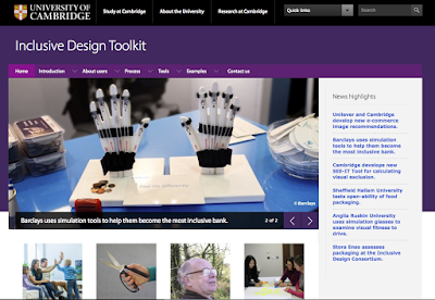
My favorite description of "What is Inclusive Design?" can be found as part of the Inclusive Design Toolkit, which is a series of articles and tools sponsored by the University of Cambridge.  

snapshot of the University of Cambridge Inclusive Design Toolkit homepage


I'm going to quote this section specifically, not so much as to the "what" but as to the "why":


"The majority of new product development projects focus on time and budget. However, this focus can conflict with delivering the most commercially successful product.
There is often the perception that design effort should be minimised in order to reduce cost and shorten timescales. In reality, the true costs of bad design (such as warranty returns from unsatisfied customers) emerge later on in the product life cycle, and have the potential to cause irreparable damage to the brand image through customer frustration."

For full context, see "Why do inclusive design?" and specifically, take a look at the section "the risk of bad design". It showcases an interesting one I hadn't considered until recently, U.S. Currency. since bank notes in the U.S. are all the same size, and until recently were all the same color, it was difficult for people with low vision to tell the bills apart. From the page:


"One costly example of insufficient accommodation of user diversity relates to the US Treasury. A court ruled that the Treasury discriminated against the blind and visually impaired by printing all denominations of currency in the same size and texture. Following this ruling, in 2011 the Treasury approved adding tactile features to US notes (Bureau of Engraving and Printing, 2011) at an estimated cost of $6.6 billion (ARINC, 2009). Subsequently, this proposal was changed to distributing free currency reader devices to eligible blind and visually impaired individuals, still at significant cost."


Additionally, to see me take a crack at discussing Inclusive Design in a recent talk, I presented "Making a Web for Everyone: Designing and Testing for Accessibility" at Agile Testing Days in Potsdam, Germany in November 2015. In it, I discuss several advantages of Inclusive Design, and what I felt at the time was a good example of it (i.e. the LoseIt! app as it appears on iPhone).

To close this out, the real win of Inclusive Design is the fact that we are proactively making considerations for the largest number of people to use our products effectively. Some may say that this will cost more, but I would argue that the costs of not using Inclusive Design principles may be much more expensive and longer lasting, as getting back reputation lost because of poor design may be impossible. These rules work in the world of toys, the garage, and the kitchen. They also work for software and the devices we have come to depend on. Let's make the most of it.


Wednesday, May 3, 2017

Give 'em the aXe: 30 Days of Accessibility Testing

The Ministry of Testing has declared that May should be "30 Days of Accessibility Testing". As in the days of yore when I used to take on these challenges and blog regularly, I'm in the mood to get back to doing that. Therefore, I am looking to write a post every day around this topic and as a way to address each line of their checklist.

Today, let's look at #3.

3. Share your favorite Accessibility tool.

I'm not sure if this counts as my favorite, but it's one I'm using quite a bit right now, and that's practically the same thing.

As I posted yesterday, WAVE is a popular Accessibility checking tool, but it looks at only one page at a time, and in a different window. When exploring Accessibility issues, I prefer to deal with the page right then and there, using something like Chrome Developer Tools or the other flavors of application out there that serve similar purposes.

If you use Chrome and like using Developer tools, then Deque Systems Chrome extension "aXe" may be right up your alley.

So let's see it in action. How about we repeat the test we did yesterday with WAVE on http://mkltesthead.com?

Image showing aXe Development Tools section


We see that the error regarding image alt tags (several of them in fact) is still an issue, and we can highlight one of the images aXe is complaining about. 

Great, so what can we do from here? We can test out a change using Developer Tools, and indeed a rescan shows that adding an alt tag drops our count of image tag issues. That change will only be good for that current session, but it does allow us to directly see the changes we apply and the effect they have. It also acts as a prompt for things we can directly modify for the image in Blogger, too. To do the latter, all you have to do is:

  • Edit the page.
  • Select the image.
  • Click on "Properties".
  • Fill in the title text and alt text as desired.
  • Click Save.
If you display the page again and rescan, you'll see the count for images without alt tags drops by one.

So what was noteworthy about that? I could do it in the same window and then recheck it after the edit and see that it was updated. Of course, this is something that in a site where all of the files are local, you can just do a regex search and identify which images don't have alt tags. Blogger doesn't give me that option up front, so this is a nice way to check for Accessibility conformance, debug in the app view, and make changes as I go. 

Not bad for a free app. Not bad at all :).

Tuesday, May 2, 2017

Wading into WAVE: 30 Days of Accessibility Testing

The Ministry of Testing has declared that May should be "30 Days of Accessibility Testing". As in the days of yore when I used to take on these challenges and blog regularly, I'm in the mood to get back to doing that. Therefore, I am looking to write a post every day around this topic and as a way to address each line of their checklist. Today, let's look at #2.

2. Use a tool like WAVE to scan a page for Accessibility problems.

Almost everyone that starts with Accessibility testing at some point early in their learning comes across WAVE. There are lots of good reasons why. First, it's a standalone page. Second, it's simple to get started. Just go to the site, put in the URL and Submit.

Ahh, but that's just the beginning :).

WAVE main page image

Let's try an experiment. How about we choose a page that's relevant to me? Heck, why not this blog? What would happen if I did a scan for http://mkltesthead.com/?


Looks like the answer is "there are a lot of issues" with my blog as it relates to Accessibility.


Let's start with the most obvious. 

  • It looks like most of the images being displayed do not have "alt" tags.
  • The language of the page is not identified.
  • Form elements are not labeled (the search bar is my guess)
  • Lots of redundant links. This is a blog, so that may well be unavoidable, but it's still worth looking at. In this case, the redundant links are the tags I use for each post. Repetitive? Yes. Necessary? Arguably, yes.
  • Contrast is low (I admit, I like the layout of my site, but it's a good bet that for color blind individuals it may well be hard to read).
I hear you all. You are thinking "OK, that's great, but so what?" Well, now I have a clearer idea of elements about my site design that I might want to change. Some I will have a hard time changing as they are part of the Blogger platform and templates, but many I can change since there are elements of the template that I can modify directly.

Redesigning my blog is not part of today's challenge, but just by doing this little bit, I'm seeing areas that I can directly control and changes I can personally make that can enhance or better the user's experience as Accessibility is concerned.

Updated: After I originally wrote this, I took a look at the contrast issues and determined where I could make a few changes. Just by picking a brighter yellow over a burnt orange for prominent text, and changing footer text from gray to white, I was able to eliminate 300+ contrast errors. Yay me :)!!!

Curious to see how your site or other sites stack up? Go ahead, have a look. WAVE makes it easy :).


Making May 30 Days of Accessibility Testing

I love it when something comes my way that literally forces me to rethink and reconsider something I already care a lot about and like to believe I'm somewhat skilled in already. With thanks to the Ministry of Testing, I have decided that I will do all I can to get into the spirit and actively blog about their current challenge, 30 Days of Accessibility Testing.

If you follow the link above, there is a checklist, and that checklist just begs to be blogged about. Therefore I'm committing to doing exactly that. It's already May 2, so I'm a day behind. That means you'll be getting two posts from me today.

Let's start with entry 1.

1. Learn about the Diversity of Disabilities and the effects of aging.

I've written about this several times on this blog, but to keep with the spirit of the challenge, let's venture into something new. I came across "Defining Disability Diversity in Society" and I think it's worth a read.

The point of the original task is to consider the variety of disabilities, of which there are many.


  • Visual disabilities ranging from mild to total blindness 
  • Auditory disabilities ranging from mild to total deafness
  • Physical disabilities ranging from mild discomfort in joints to complete immobility or absence of limbs
  • Cognitive disabilities that likewise run across a spectrum from mild to severe
  • Learning disabilities
  • Emotional disabilities
There are even situational disabilities. It's easy to think that there are two classes of people; those who are normative, and those who are not. Yet there are situations that can, in an instant, turn someone from normative to disabled. They may be temporary (loud settings, darkness, foreign countries, etc.) or they may become permanent (injury and age being common forerunners).

I'm currently experiencing one example of a disability entirely related to my age. I'm no longer able to read anything comfortably without reading glasses. If I forget them, doing anything that requires me to read or type is compromised. At those times, I find myself looking at the options available in Accessibility tools. Not to test but just to cope with the situation.

I actually had this situation happen Sunday night. I went to a meeting for my daughter's upcoming camp counselor training, and I forgot my readers. I was next to useless when it came to reading anything close. Stuff that was written on the whiteboard I was OK with but that was across the room and large enough so I could see it clearly.

Truth be told, I didn't really think much about visual accessibility other than as a set of tools I'd need to know to test with until I turned 45. As a special birthday present, I was given a gift of near-sightedness (or where you struggle to see things close up, I always get the terms confused). In any event, that change in my daily reality took me from being an involved participant in Accessibility discussions to being committed to working on their behalf.

Chances are, you will have a similar opportunity to come to grips with this and other age-related ailments. Normativity is relative, and it's a moving target. At some point, all of us will fall outside of it and realize that we are part of a large community of "non-normative users" (there, that's a term for you just in case the term "disabled" bothers you).

Methinks this will be a very productive month :). Stay tuned.